michael osterholm (amongst others) has been on an all out offensive of late about the high risk of new variants and impending covid surges. his latest set of claims is that the new variants are high risk to children and that schools are a danger. to assess these claims, let us first examine the track record of mr osterholm who spent much of his career as a fauci disciple at the NIH funded flu center in minnesota.
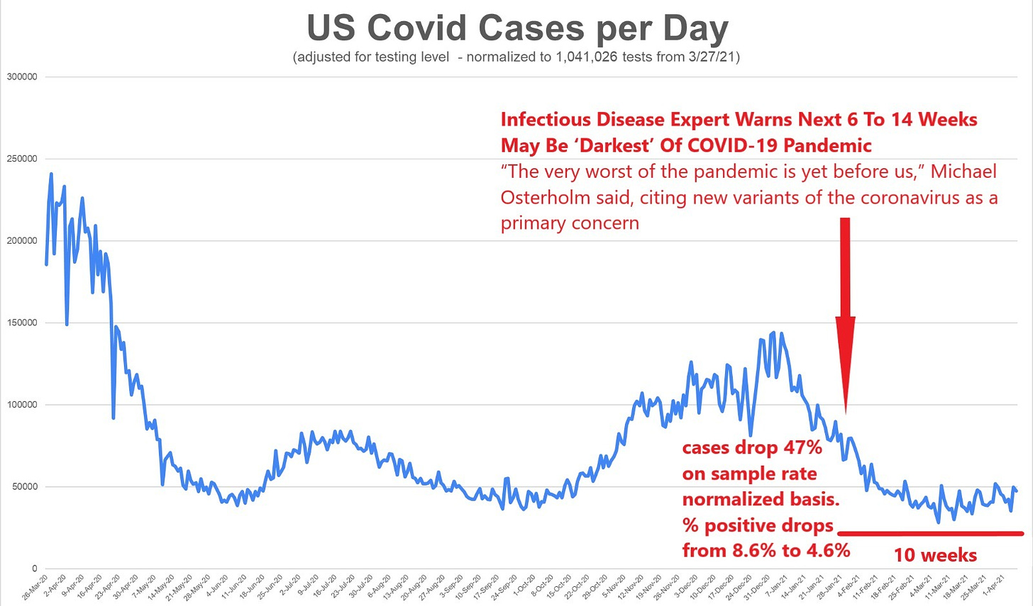
in late january, he famously stated that new variants we about to bring the “darkest days” of the pandemic. this was duly foregrounded and spread by the huffpo (and many others). you can see it here: DARKEST DAYS. so how did this claim pan out?
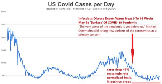
not so well. cases (adjusted for testing level) dropped 47% in the 10 weeks following his claim that the next 6-14 weeks would be dire. positivity rate on tests dropped from 8.6% to 4.6% (thru april 6, the last day for which i had aggregated data)
a word here on what i did: case counts are meaningless on their own. if you test any given population twice as much, you get twice the reported cases, but this is not indicative of more disease, it’s just a higher sampling rate. this is stats 101 stuff, and yet health officials and alleged scientists continue to push raw, unadjusted covid positives as “cases” as though it means something. but testing level is the single biggest driver of case counts. the cases are not up from march and april last year, they are down once you control for testing levels and normalize the data as i have done above.
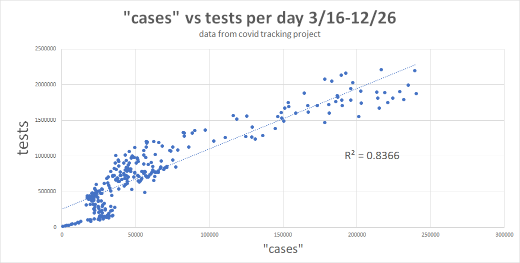
i pulled data last year on this and found that the R2 for testing vs “cases” on a daily basis was .83. that’s staggeringly high. testing count predicts 83% of case count.
you can see the same data here as curves:
not controlling for this testing level makes the case peak from jan 2021 look like it’s 4X the height of the april 2020 peak. in fact, it was 42% lower. the raw data being used in public is giving the whole pandemic the wrong slope. this can be easily seen here:
and this is readily confirmed by the % positive rate on covid tests in the US. this winter had far less covid than last april.
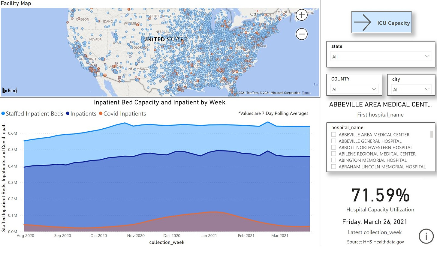
similarly, we see covid hospitalization way down and loads of US hospital capacity. it appears these dark days have failed to materialize.
a bad map is worse than no map at all, and raw case data is a REALLY bad map. this is why i am such a stickler for testing level normalization. without it, you have no idea what you are looking at. this is a key concept, so please keep it in mind as we explore osterholm’s latest variant claims.
the new variants: children
unable to sustain the narrative that covid is on the rise, the new line of claims seems to be “but this time, it’s the kids” and michael is one more in the vanguard of fear pushers.
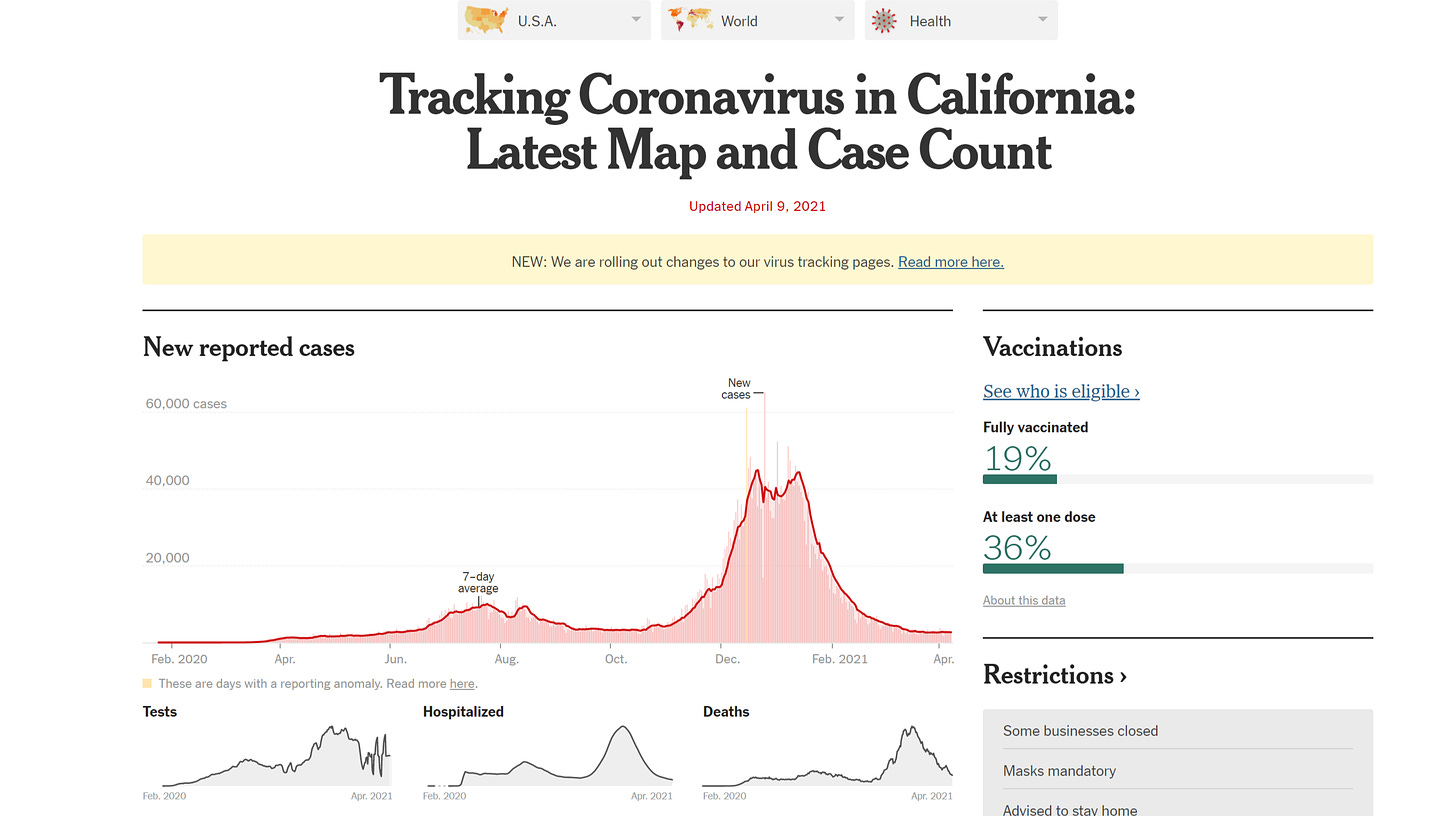
wow. this sure sounds scary. but is it true? not that i can see, no. most of this is mistaking cause and effect and making bad inferential leaps. first off, B.1.1.7 is not new here. it’s been running around the US since November. further, the idea that it is suddenly some huge threat is specious. this is the same threat dr charles chiu from UCSF made in february when he claimed “the devil is already here” in california. you can see his histrionics here: CHIU . the data has not borne him out. covid kept dropping in in california in a classic gompertz curve:
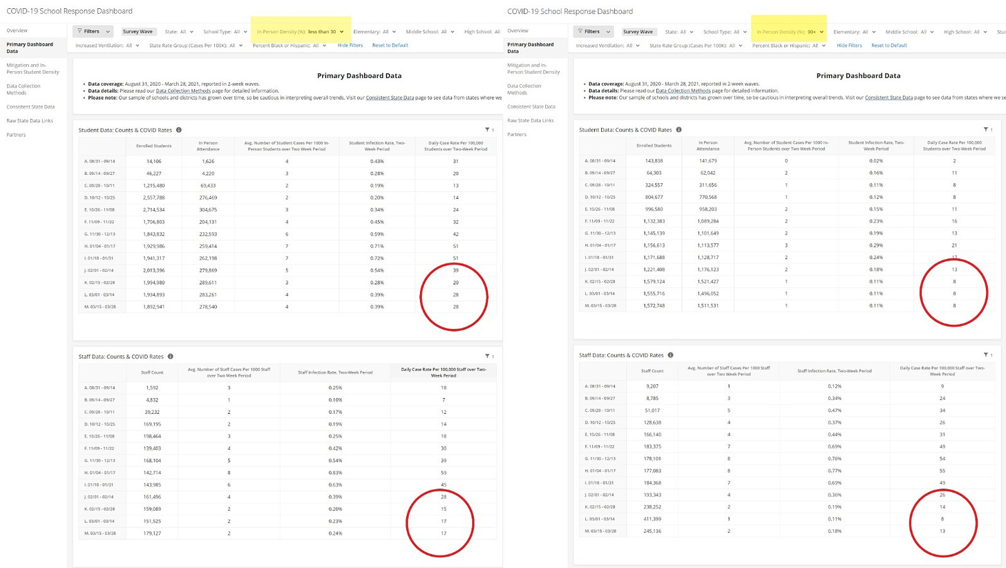
the “variants” are not driving much of anything save media sensationalism. ‘but what about the children!?!” well, i’m glad you asked. most of these databases are not stratified by age so it’s hard to pull out a general case, but we can look at schools thanks to brown university (the gato’s alma mater) professor emily oster who has consolidated a wonderful database of US schools, their policies, and their covid counts. you can play with it here: school dashboard .
i took 2 cuts at the data. the left is schools with less than 30% in person. the right is schools with over 90%. the data is telling in two ways:
schools with lower in person have higher rates of covid for both students and staff: 28 per 100k vs 8 for students and 17 vs 13 for staff.
both school groups show dropping covid prevalence since their peak in early january. they are following the same curve as the US as a whole. kids are down ~50%. staff is down ~70%.
if in person schools are spreading covid it certainly does not show up in the data.
this is, of course, in line with about 100 long term findings that schools do not spread covid. we’ve known this for some time and this study from last summer was quite telling. SWEDEN STUDY . it compared students and staff in swedish and finnish schools. sweden was open, unmasked, and un-distanced. finland was closed. there was no difference in outcomes. this is because asymptomatic people do not spread covid STUDY DATA HERE and neither do children to any great degree.
if you feel ill, stay home. wash your hands. do those 2 things, and schools are extremely safe for covid.
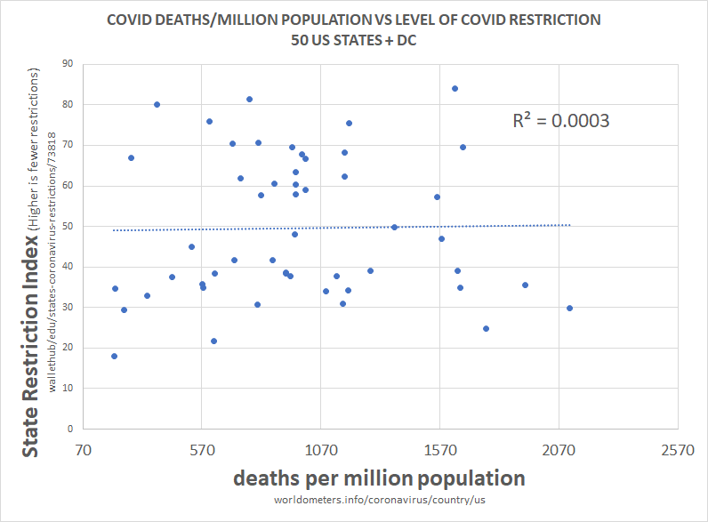
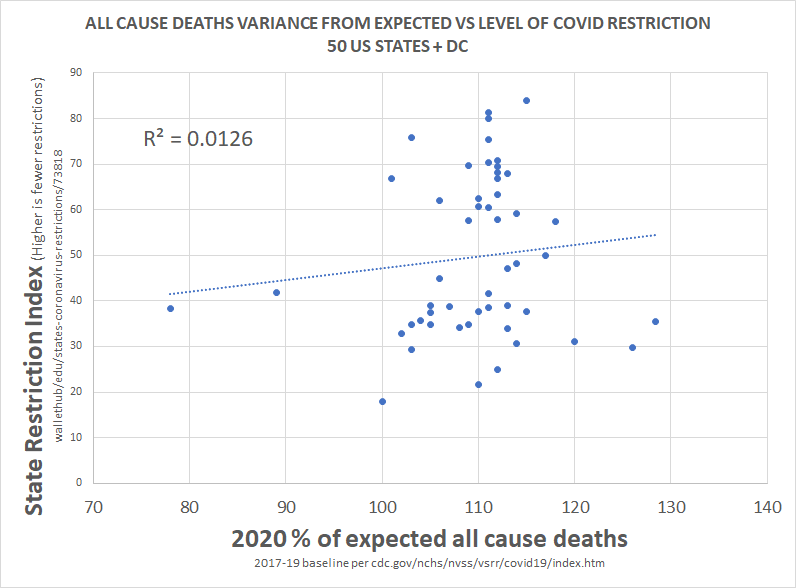
no other mediation via NPI (non-pharmaceutical intervention) appears necessary and such interventions have not been efficacious in any event. there has been no correlation between restrictions and outcomes on either overall per capita death or on all cause deaths. correlation does not prove causality, but a lack of correlation makes material causality pretty near impossible.
once more, osterholm looks to be onto a loser. he’s cherry picking places where schools went back into session and where testing levels spiked as a result because many are doing large, mandatory testing programs. these programs use a PCR test at 40 Ct that is so oversensitive that it produces large false and false clinical positive readings. this means that going back to school makes it look like child cases are spiking because the sample rate rose so much and these people are using raw data unadjusted for this huge rise in tests. this would likely happen even in a world where there was no clinical covid. it’s a preposterous system.
schools open = more testing = more raw case data for any given population = close schools. repeat until no child in america can read.
this is pseudoscience justified by statistical illiteracy. i, for one, find it hard to believe that mr osterholm does not know better than to make an error that would get you failed on your second stats 101 quiz.
as with so many of his past claims, this is based not in science or in data but in breathless anecdotalism served with a health dollop of empty credentialism. it has no place in public health policy.







Your method of normalization seems too strong to me. Suppose there are two groups of people getting tested: 1. those that have good reason to believe they have Covid (symptoms or extended contact with known case) and 2. those people who have no good reason to believe they have Covid (no symptoms, no known extended contact). Your method seems to assume all tests are of group 2 variety, and therefore more tests -> more +'s. However, for those in group 1, the causality can go the opposite... it's because there are more symptomatic people that we have more tests, so that is truly a signal of more cases. So, to me, to normalize properly we would need to know the split between groups 1 & 2. My anecdotal evidence would say there is a ton of group 2 vs. group 1 (and thus your method is pretty good), but I don't know if we have data for that.
Scariants smariants. Here's something to ponder. Astra-Zeneca vaccine was trialed in UK, South Africa, Brazil. The new variants were discovered for the first time in UK, South Africa and Brazil, and nowhere else. Alarm bells ringing? Calm down, correlation does not prove causality (nobody has bothered about that dictum very much during this panicdemic). Here's my hypothesis: To accompany the trials, genomic sequencing was massively increased in the trial countries, so much so that UK did the most genomic sequencing of anywhere worldwide. I haven't confirmed this, but in my opinion, the scariant hysteria has been caused by "Seek, and ye shall find". Very similar to the PCR fiasco fueling the "cases" hysteria. Final thought: would it have been better for humankind NOT to have had the half-understood technology with which to frighten itself?