all cause deaths and vaccination status
UK data provides a BIG piece of the puzzle (and aligns with the vaccine RCT's)
i spoke a little while back about how what would be really useful is the ability to look at full, all cause deaths data by age and vaccination status and how this would surely be about as good a data on overall public health impact as one could find.
it takes everything, all the protection, risk, fatal side effects (known and unknown), and who knows what else we failed to think of into account.
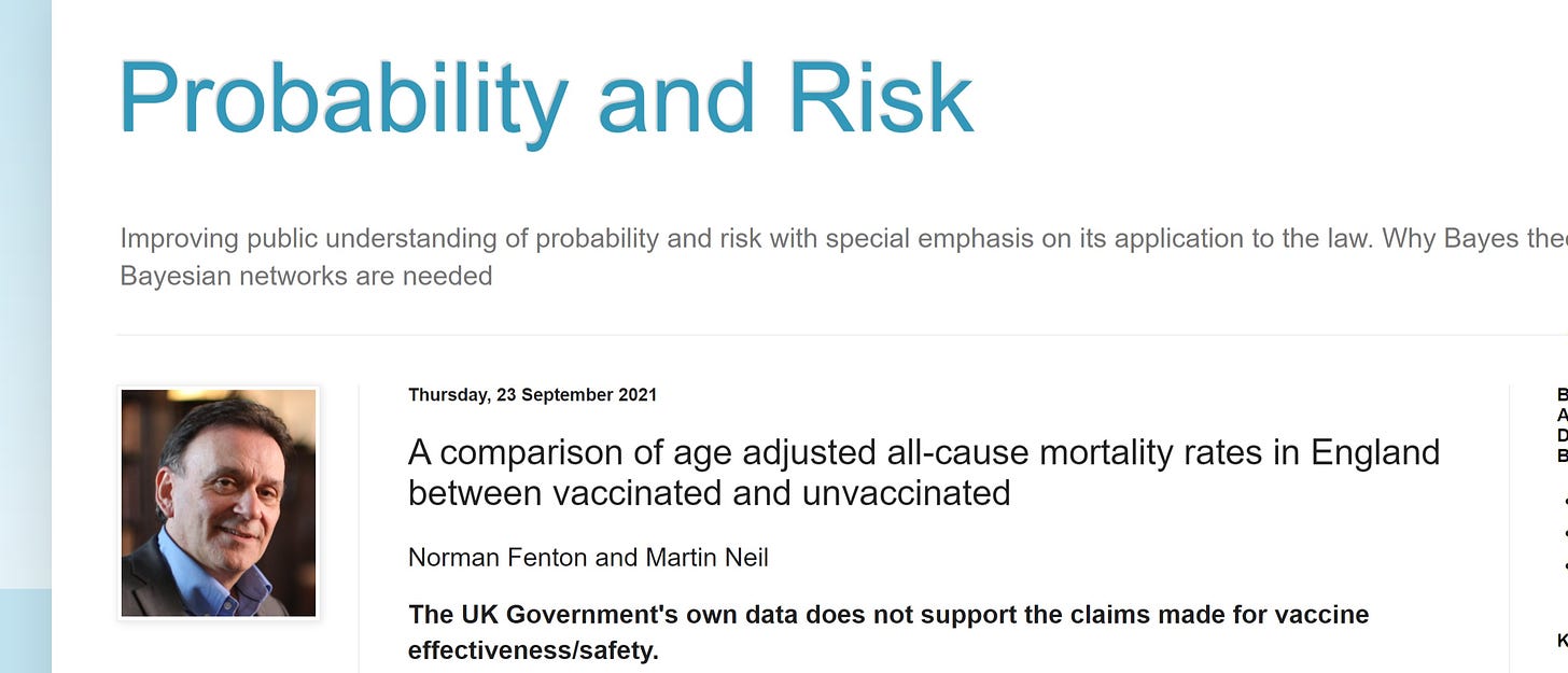
well, one of the great parts about living on a ball with nearly 8 billion people, some quite smart, is that sometimes, you get exactly what you asked for. THIS ANALYSIS, performed by norman fenton (professor of risk information) and matrin neil (professor of computer science and statistics) is JUST what the gato ordered.
it’s a great write up, well written, well caveated, and easily accessible. if you have not, you should all read it.
because many of you likely won’t, i’m going to hit the high points here and amplify and add context and data.
they dug into the UK ONS data and found age standardized all cause deaths data. they then controlled for cohort size in each of the vaccinated categories:
unvaccinated
dose one with 21 days
dose one more than 21 days (and no dose 2)
dose 2 (fully vaccinated)
then, because, like some internet felines you might happen to know, they took issue with not including the partially vaccinated in the vaccinated bodycount, they aggregated all forms of vaxx into one cohort to compare to the unvaxxed. (huzzah!)
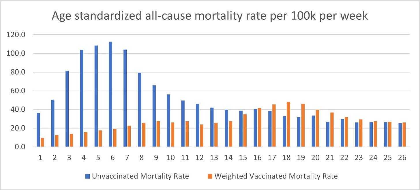
they then looked at the unvaccinated mortality rate vs the vaccinated and plotted this fascinating chart.
addendum: some people have expressed confusion on how these charts are presented. the Y axis is weekly all cause mortality per 100k standardized for age. the X axis is week of the year. (week 26 ends July 2 in 2021)
it’s clear that early in the year the vaccinated mortality rate was far below the unvaxxed. but it rose steadily and the unvaxxed dropped sharply. it’s quite possible that that early deaths rate was inflated by the very sick, already in hospital or some such, during peak disease and deaths season, and already near death being simply too weak to vaccinate. (or it could be other things, it’s hard to say anything certain)
but:
for each of the 11 weeks leading up to week 26 (ending 2 july) the vaccinated mortality rate has been above that of the unvaxxed.
we can pull this apart and stratify it further:
clearly, those with 2 full doses are outperforming (and even now look to be better than the unvaxxed). this is consistent with the VE data i calculated for the UK.
BUT: look at the other cohorts.
getting one dose and never a second (21 days or more) is a seriously negative position to be in. ACD is about 90 in week 26 vs about 25 in unvaxxed. whether this is a result of the vaccine or a risk stratification selector where those with health risks reacted too badly to d1 to ever get d2 (or some combination) is an open question, but it’s also sort of moot as you clearly did not know, a priori, which bucket you’d fall in when selecting to receive dose one.
so you do not get to disaggregate them. that’s how real life works. counting only the lottery winners and not the losers is not a sound basis for decision making.
“within 21 days” mortality rate is also instructive as it looks to track about 40% higher than unvaccinated. i suspect it would be higher still if we limited it to 2 weeks as in the danish study. by week 3, VE looked to be about 1.0 and so it dilutes what looks to be a 2 week signal.
and when we aggregate all this, we get a picture.
YES, being fully vaccinated (likely d2+7 or 14 days) DOES look protective on all cause mortality.
NO, when you add in all the other vaccine outcomes, it DOES NOT look protective on all cause mortality overall, at least not anymore.
SO, taken as a whole, these covid vaccines do not look to stop all cause deaths.
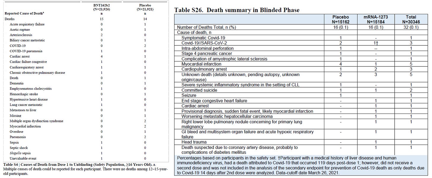
interestingly enough, this aligns with both the pfizer and the moderna 6 month vaccine data. they both buried it in their supplements, but neither showed ANY all cause death benefit. (detailed look at pfizer HERE) raw data below (pfizer L, moderna R)
so we’re starting to get a pretty sound picture here validated by multiple, independent sources, 2 of them RCT’s.
vaccine risk reward may be positive for some, but for the full class of those vaccinated in the UK and in the 2 mRNA drug trials, there is no overall all cause mortality benefit.
none.
we can further explore this issue in looking at temporal trends.
this seems to have dropped, which is what you would expect over time as high risk people got vaccinated first.
but this one is much more interesting:
those that got one dose an then did not go on as planned to a second are showing a rise over time to a very high level of risk. this seems to make the risk stratification at start issue a less plausible explanation for their poor outcomes and perhaps to indict vaccines. if risk strat was the culprit, you’d expect this to be more constant.
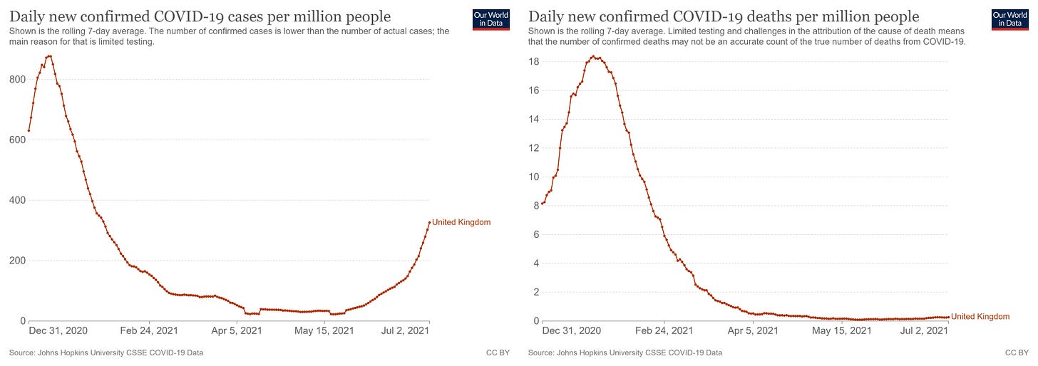
i plotted cases and deaths over this same period and it does NOT seem to be the driver of the rise. the upturn in cases commenced may 25, which is in week 21. ACD was already at peak then. that rise looks to be something other than a covid surge.
this appears ominous and warrants more investigation.
and so does this:
second dose mortality has been drifting up significantly and, like 21+, did so in a time of exceedingly low covid (and while unvaxxed was dropping). it basically doubled from week 14 to week 26. it’s still below unvaxxed, but as we saw above, not when you aggregate ALL vaxxed to include all those post D1 as one must to get a fair risk assessment.
this lines up with much of what we have seen on vaccine fade and implies that this fade is not just in terms of case prevention, but in mortality prevention as well.
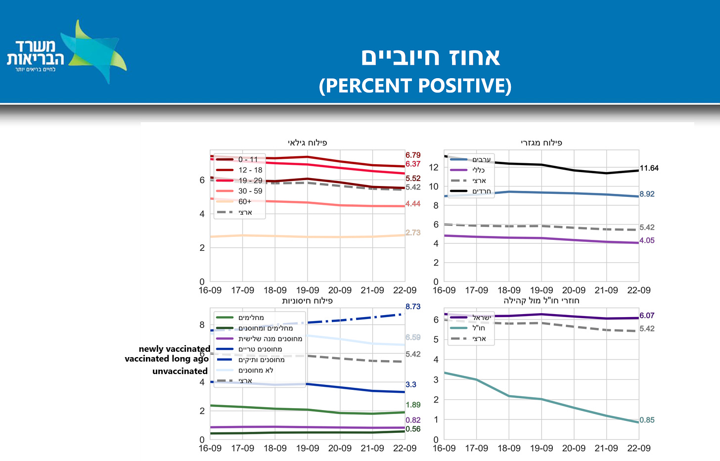
it also finds provocative alignment with new israeli data:
(translations on hebrew from gatopal™ @RanIsraeli)
look at the lower left. the solid dark blue line is the “newly vaccinated.”
as can be seen, they are showing lower case positivity than the pale blue line (unvaccinated).
BUT, look at the dashed blue line “vaccinated long ago” (over 6 months). not only is that line higher than unvaxxed, but it is rising while unvaxxed is falling.
now THAT is an ominous trend and makes me wonder what we’re going to find in the ACD deaths data for UK when we update it for august and september, because, if it mirrors that, whoo doggie, it’s not going to look good.
all this work is a mosaic.
the data is sparse and of questionable quality and we’re not doing anything like randomized controlled trials here.
(and WOW is it both unfortunate and somewhat sinister that the two big vaccine RCTs both eliminated their control groups 3 months in before all the vaccine fade issues began. that data would be priceless right now, albeit perhaps not to shareholders of pfizer and moderna…)
BUT, this is a big piece, perhaps one of the biggest we have and it fits SO neatly with the other pieces that i think we’re really starting to see the shape here and the shape is not encouraging.
these vaccines are not stopping all cause deaths overall.
the vaccine trials and read outs were designed to hide this.
(and yes, i think it was deliberate. pfizer and moderna are VERY good at trial design. they do not make “mistakes” like this. they make “choices.”)
reporting only the dose 2 + 7-14 days results and ignoring all the rest and the all cause deaths and full course AE’s in the headline readouts was meant to obfuscate, not to inform and its subsequent adoption by health agencies and their reporting has made a mess of the data and rendered much of it useless to gauge actual unified impact.
if you win the lottery and get a 2 dose no whammies outcome, you look to outperform unvaxxed by about 40% as of week 26, but this also looks to be fading and will likely keep doing so.
but so many people lose this lottery and get shot trying to run for the bunker that it offsets this and then some.
this does not mean it’s not a good bet for some, but it does mean it’s been a bad bet overall for the full program and given the way risk stratifies here and the number vaccinated, that probably means that 2/3 or maybe even 3/4 of those vaccinated faced a “bad bet” with odds not in their favor.
that is not a sound basis for public health and an obscene basis for a public mandate.
(especially given the leaky nature of the vaccines and their failure to stop spread and increasingly likely intensification of it.)
this is an issue to dig deeply into and soon.
i’m going to see if there’s a way to update this for aug and sept.
and we’re getting there guys. the puzzle is coming together.








As a recent subscriber, I want to say how I love your analysis. But I’d find it ever so helpful if you would spell out the abbreviations upon first usage in each post as I am not a scientist and do not know what RCT means. (Yes I did , after some research find what I assume it means Random Controlled Trial). But this makes the posts hard for the average reader. I’d like to help spread your data analysis. This makes it more difficult for us pedestrians. Also, it would be cool if you wrote a brief “synopsis box” at the end or the beginning so we know what we are looking for. Something we can easily digest and get the gist of your detailed work. I got it , your a cat nerd and I love that but throw me a bone and help me spread your analysis among the great unwashed. I could break it down and do it my self but I do t like the idea of copying your original work. I’d like you to get credit. Anyways, just a thought.
I've nothing clever to say here. Just well done and thanks for pursuing this.