
pfizer safety and efficacy: 6 month study
this trial is a bit of a glamour shot, but provides some useful data.
pfizer’s “Six Month Safety and Efficacy of the BNT162b2 mRNA COVID-19 Vaccine” study is out.
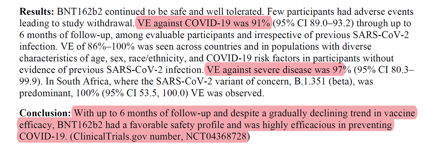
as one would expect from a study funded by the drug designer and written by a pfizer employee, the claims are laudatory. this vaccine does look, in an RCT, to inhibit covid cases, severe covid, and possibly covid deaths. the authors go so far as to make these claims:
so far, so good.
but can they really back these claims up? the answer there is more mixed.
most importantly, how does the risk ratio look on vaccine risks vs protection offered?
there the data does not look great. they buried it a bit and glossed over possible problems, choosing to foreground what made them look good and hide that which did not.
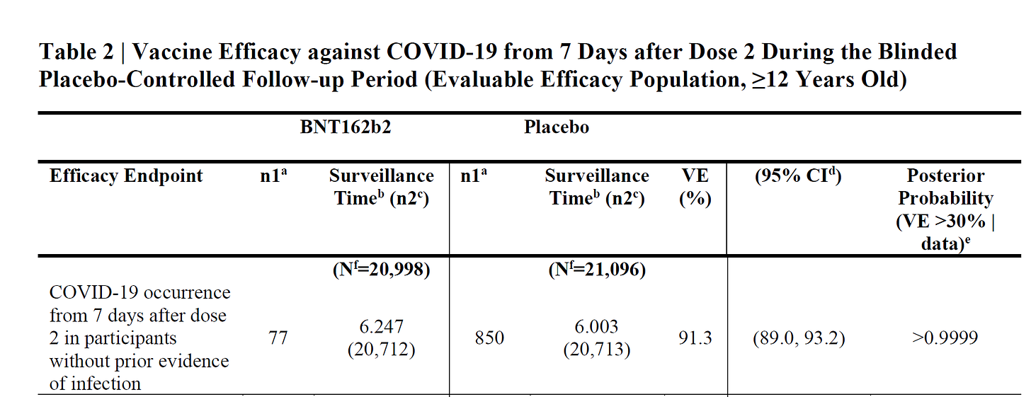
one of the big dodges common to these mRNA vaccine studies is to base efficacy ONLY on the period commencing 7 days after the second dose and ignoring the 3+ weeks in between. this one is no different. this is a slanted design.
if vaccination itself poses risks (and it does) this is a very skewed way to assess overall risk experience. taking the vax is clearly a risk that must be experienced to get later benefits. therefore it warrants inclusion in cost/benefit calculations.
they also test only the enrollees who show symptoms, not all subjects weekly as some (like AZ) did. this reduces false positives and enhances reported efficacy.
they also used fairly young cohorts (avg age 51) of whom 79% had no comorbidities (via charleston scale) which is pretty far away from the old and comorbid demographic where most severe covid and death was found.
this is only the best angle for the data.
it’s not so much as a vaccine study as an instagram selfie. hips canted, fishface, add filter, and you’re ready for tinder.
but what’s behind the glamourshot?
let’s have a peek.
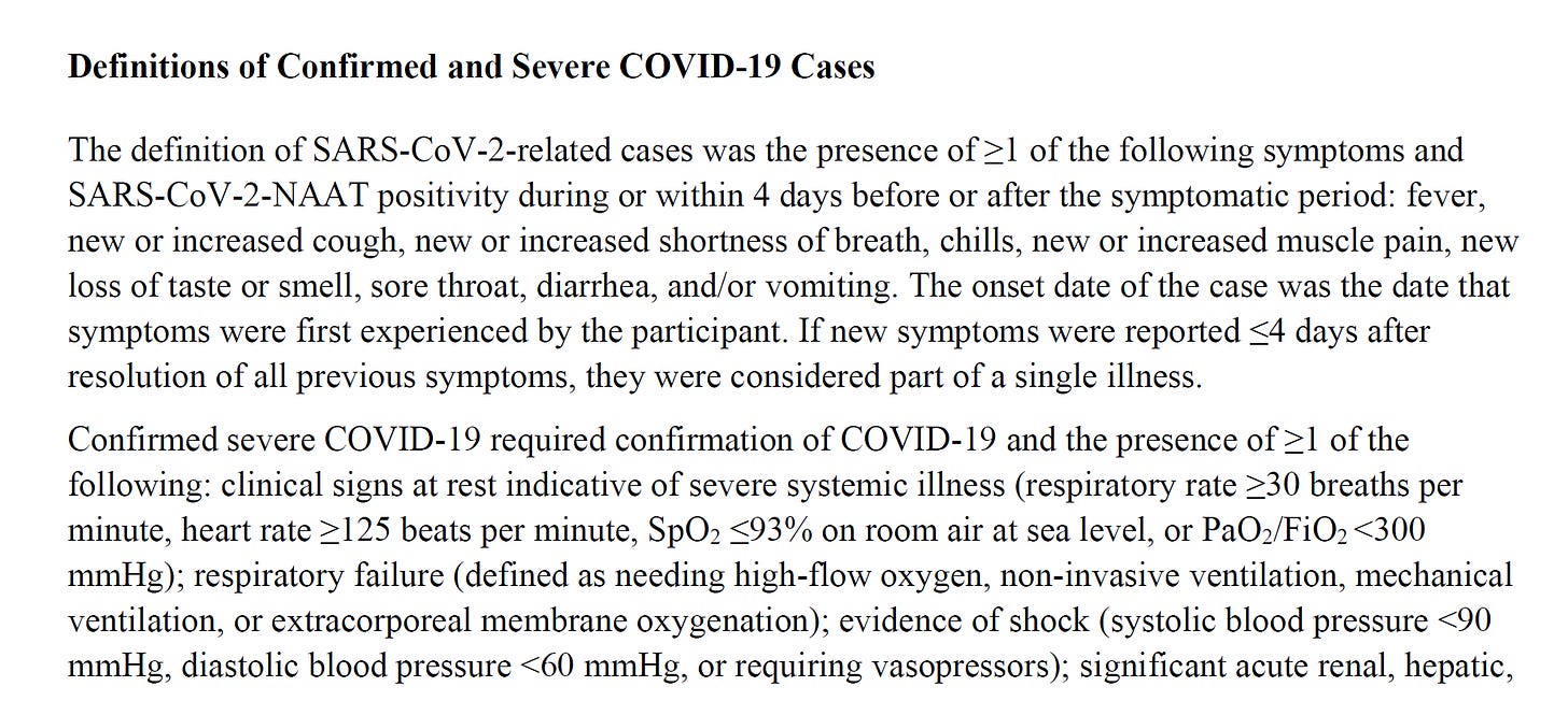
the snapshot looks great. good curve separation. note that unlike public health measures all these cases required symptomatic confirm so this is NOT going to map to the overly inclusive casedemic numbers driven by calling any PCR+ a “case”. this is a much more limited definition .
the curves:
unlike the danish and swedish studies, VE (vaccine efficacy) does not drop to sharply negative figures in the period between shot 1 and 2. it’s not great, (18.2% to day 11) but it’s not the gruesome -104% the danes showed or the -33% from the swedes.
(though do note that the 95% confidence interval reaches down to -26% for 0-11 days post s1)
this variance from 0-11 days post shot 1 is provocative.
from 0-11 days, they logged 667 patient years of surveillance time. the danes logged 1,388 in NH residents and another 3,425 in HCW’s. it’s about 7X the data.
but the big variance is in cases per patient year of exposure. it’s 6% per yr for pfizer vs 35% for the danes. this will be a feature of the pfizer data: it comes from a time of very low prevalence. this tends to make efficacy look better. surging disease with seasonal tailwind it harder to stop. (danish sudy was dec 2020 to feb 2021, peak season)
for this reason, i’m more inclined to trust the danish and swedish data for RW relevance. we care about peak disease more than trough.
but, there could be another confound which is that the danes used PCR+ as a case standard and did not require symptom confirm. so maybe they are measuring like a health agency vs like a vaccine company.
added to the variance in patient risk from comorbidity etc, these studies are hard to compare directly.
that might mean that the worrying scandanavian spike in covid vulnerability is just an artifact of oversensitive testing. it might also mean that pfizer just selected too strong a test population for this to really show.
they got a 96% VE in over 75’s. the danes got 64% in nursing home residents. there’s an awful lot of gap there. one would expect to see danish numbers map more closely to those reported by health agencies, but one could also argue that you really only care about symptomatic cases and that the danes are following a global mistake and the pfizer methodology is more sound when discussing clinical outcomes for patients.
these incompatibilities will require more studies to iron out. i’d love to see one study compare PCR+ vs PCR+ and symptoms to show a variance.
but the pfizer study has some other issues to discuss, so let’s move on.
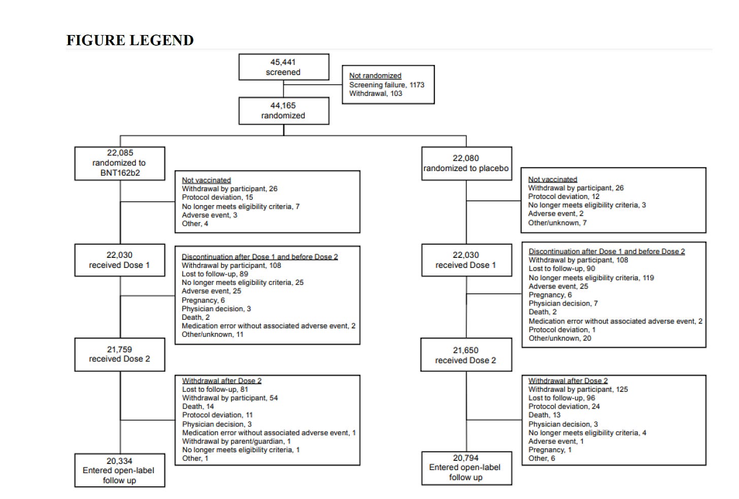
this is the study diagram:
you always want to look at these flows. you can play all kinds of definitional games with adverse events, claims of what is and is not related, etc, but dropout rates taken as a whole tell an interesting story that’s hard to hide.
they randomized the enrollees and split them into 22,085 vaccine and 22,080 placebo control arm. that’s what went in the top.
what came out the bottom for the actual “trial evaluation” was 20,334 and 20,794. oopsie.
this means that 1,751 (7.9%) fell out of the active arm and 1,290 (5.8%) fell out of the placebo.
that’s a considerable variance to not read as a safety or tolerability signal. a drop out rate 36% higher in active is quite a lot. it’s an extra 461 patients lost in a study where only 2 people died of covid and only 31 had severe. you could hide a whole outcome in there.
not enough for a smoking gun, but enough to lead to suspicions and pointed questions.
it also foots questionably with this data:
clearly, we had a much higher event rate in vaccine. 23.9% were deemed “related” vs 6% in placebo.
here the fact that placebo had 6% related events seems to imply that that they used an ACTIVE placebo. but the study claims to have used saline. i struggle to imagine how saline could be so maladministered as to cause a 6% AE rate and a 0.7% severe AE rate.
this cries out for better explication. something smells off there.
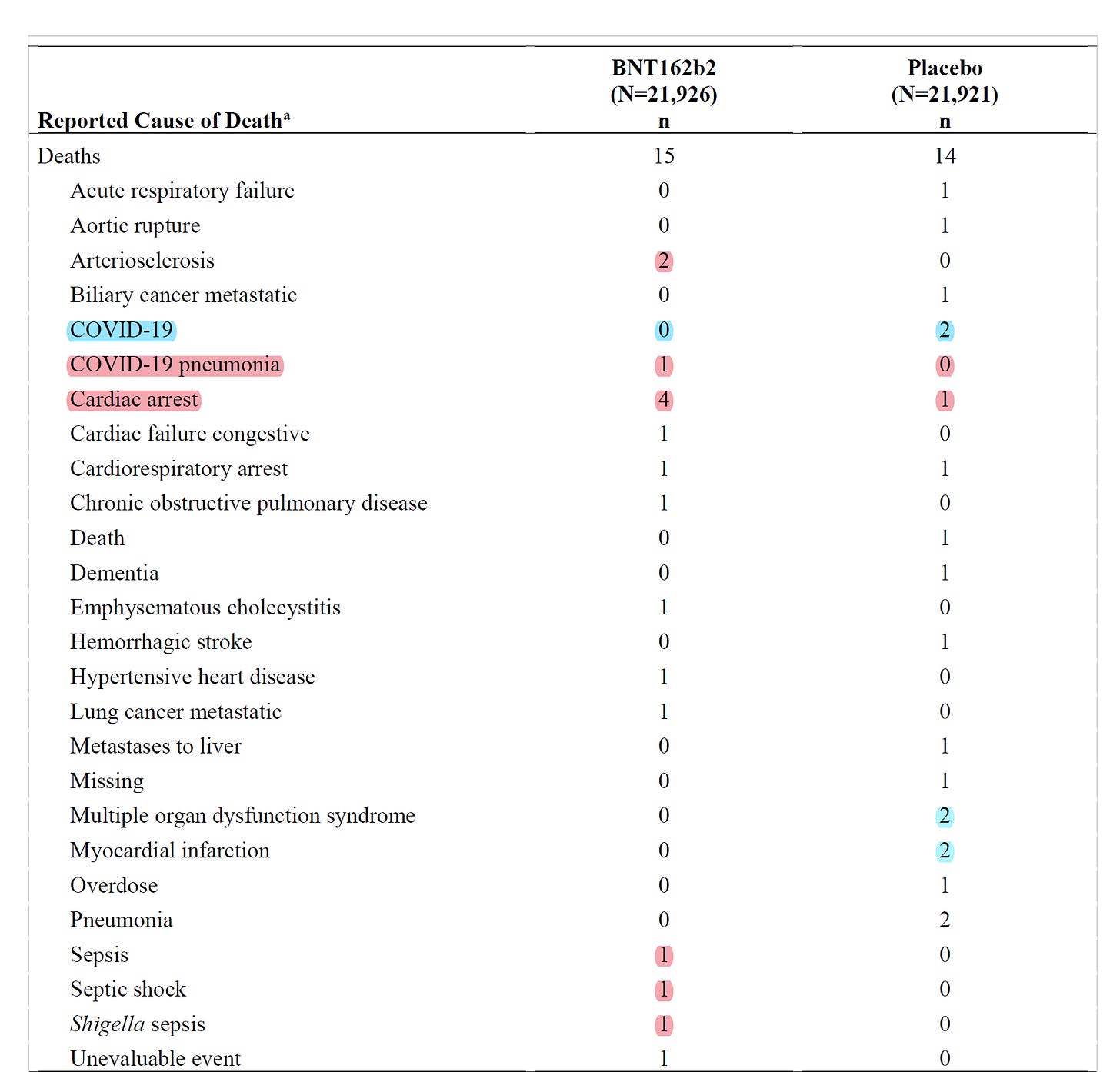
according to the data, we saw 112 more severe AE’s in active. that’s far less than the dropout variance even if everyone dropped out. the death figures are also puzzling because of this chart i found buried in the supplementary appendix. (a word on supplementary appendixes: this is where researchers hide the dirty laundry. it’s the data that goes in the drawer, not on the coffee table. always, always read them.)
this is the full picture. it’s deaths from dose 1 to unblinding (the real risk window, as discussed earlier) it is not flattering for pfizer.
deaths in active arm were higher when you include the full risk experience of taking the vaccine. that 3 vs 5 looks to have washed out the risk period of bad vaccine reaction.
when we add it, all cause death no longer favors vaccine. the study says this:
the supplement data says this:
this has a couple of interesting facets. we’re dealing with small numbers here, so let’s be cautions drawing strong conclusions as randomness can be hard to rule out, BUT we see a several things:
vaccines did look to protect against covid. 0-2, though there was a death from “covid pneumonia” in the vax arm, and that smells like definitional games.
vaccines had a conspicuously higher rate of heart malfunction related deaths 4-1 on caridac arrest. that’s a significant signal in a drug with know myocarditis issues. add in 2 arteriosclerosis and it’s 6-1 add in the 2 other failures and it’s 8-2. that’s not insignificant.
3 deaths from various types of sepsis in the vax arm vs zero. sepsis is nasty stuff and a terrible way to die. this looks pretty weighted to ignore.
it seems aggressive to claim that “none of these deaths were related to vaccine” with so many heart issues and so much sepsis.
this is, again, not quite a smoking gun, but it’s yet another iffy looking interpretation, especially give AE variance and dropout rate divergence. it starts to smack of hometown reffing. there is no real explanation of how these events were all deemed “not considered related” and there needs to be. this is the crux of risk reward and the VAERS data is showing worrying signals and experience in higher risk cohorts would be expected to be worse.
so, all in all, some real safety signals and some meaningful questions. the full death count looks like it does not favors vaccine.
to double check this, i looked at risk balance in the cohorts, especially around heart issues. they seemed well matched. nothing that would drive a ~4:1 signal in heart or so much sepsis.
this would seem to imply that the vaccine overall is not mortality protective despite being symptomatic case protective. rigging it for “only data from 7 days post second shot” occludes this. it’s bad data methodology akin to saying “porsches are great, get one!” and ignoring having to pay for it.
there is some positive data:
and this data on severe cases is positive for vaccine:
but seems limited once again by low overall incidence. 0.14% severe cases in placebo. that speaks to a low prevalence test period and that favors vaccine efficacy, an unusually healthy test cohort, and strict definitions.
this is a best case outcome that one would not expect to map well to general population once the high risk populations were included. only 21% having any comorbidities at all misses most of the game on severe outcomes.
risk/reward:
the news is not all bad, but there are a lot of signs of games here. it’s not a terribly high quality study, the design is rigged to occlude overall risk for vax arm, and dropouts, AE’s, and deaths are issues. subject selection makes the data a best case scenario.
but let’s look at risk reward:
overall, vaccinating 22k people stopped 29 severe cases of covid and perhaps 2 deaths, though it may likely have caused more deaths from reactions than it stopped from covid.
this was at the expense of maybe 4000 extra related adverse events, at least 110 of them severe. so you have a 110 severe AE cost to 29 severe covid savings. this could easily be 262 to 29 if we rule out the alleged “severe reactions” to saline injections that are claimed. (this seems a suspicious claim)
is that a good risk profile? not terribly, no.
might it be worthwhile for high risk? yes.
but the study does not speak a great deal to this as high risk were mostly excluded. severe covid and death generally maps to 3 or more comorbidities. (i’ve seen studies where typical death had 5-7)
might this vaccine be a bad risk for the young and healthy? yes.
that’s really what this study is mostly showing us, because it was mostly in the young and heathy. the fully loaded AE and death risk looks out of proportion to risk variance to placebo group, especially if we exclude these odd “severe reactions to saline.”
would this vaccine stop spread? this study really cannot tell us. it might. asymptomatic spread is FAR lower than symptomatic to the point of not constituting much of a vector, but it’s also possible (though weird) that mRNA vaccines suppress symptoms but not viral load. (but this sounds awfully fishy to me and i want to see some much better data than i have before buying in.)
in conclusion:
this is not medical advice. i’m here to provide information, not to tell you what to do.
ask your doctor, but go armed with data and questions.
healthcare is always and everywhere a cost/benefit decision.
only you can make choices for you and being engaged in and informed about your own health decisions is a life habit that will pay enormous dividends.
it’s one worth cultivating.











Great stuff per usual- Doctors are not taking the time, nor do they have the statistical background to be able to interpret and then give advice. I see too many Drs. saying "get vaccinated" (i.e. SHOT) without delving into their patient's histories and that is concerning.
Wondering if Dr. Eric Topol read the report? Sam Harris had him on a recent podcast and their level of detail was "Get vaccinated." Disappointing that Sam puts so much blind faith trust in other 'scientists.'