do vaccine rollouts correlate to disabled americans?
with this much flak, might we be directly over an important target?
i have long been friends with ben. he’s done a lot of great work, runs a fantastic site on US all cause mortality, and has broken open a number of important issues around covid.
this may be another.
and it was not up for an hour before twitter not only marked the tweet as disinformation and locked ben out of his account all for asking a simple question that pretty much leaps out of this data.
the data comes from the FRED tool run by the st louis federal reserve bank. they are a well respected and high quality government run data source.
hard to see the problem with the data.
clearly, their issue is with the conclusion.
and, well, streisand effect and all, well, it caught my attention because naughty kitties love reading banned books.
correlation does not and cannot prove causality, but it can sure give us some strong hints, especially when we already know how off the charts the adverse event rate from these vaccines have been.
and boy is this timing provocative…
so, being the kind of gato to want to play with the data myself, i downloaded the set and graphed it.
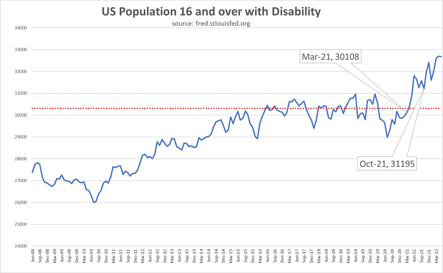
as can be seen, this series was very stable for the prior 5 years. the dotted red line is the average value from 6/16 to 2/20, right before covid starting having effect.
this data comes from the current household survey. the drop for covid is likely a drop in survey response but as can be seen, it rapidly normalized.
then covid vaccination started.
the first callout is when vaccinated reached 1%.
the second is when boosters reached 1%.
i chose this convention because each has a sort of long tail at a very low level leading in but rose rapidly after reaching 1% so it seemed like the best inflection point for maximum relevance.
as can be seen, the timing is highly suggestive.
and it makes sense.
seeing this:
without a rise in disability reports would be surprising. we see 14k permanently disabled in VAERS. and we see a rise in the disabled rolls of 1.8 million. that’s pretty close to the 1-2% capture rate (more like 1%, but also likely capturing other categories as well, so hard to be precise) for reporting we’ve seen around other VAERS issues (besides death which seems to get better counted)
so it feels like we’re in a ballpark here.
and it does not look like “long covid” because the original covid strains were more severe and yet we saw no evidence of this disability spike pre-vaccines.
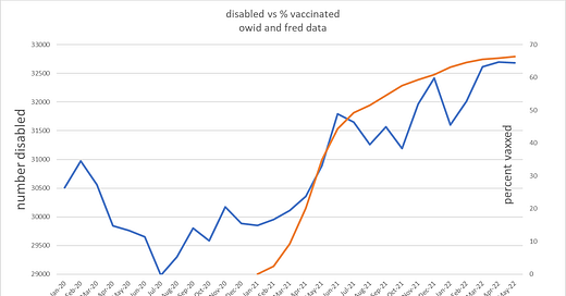
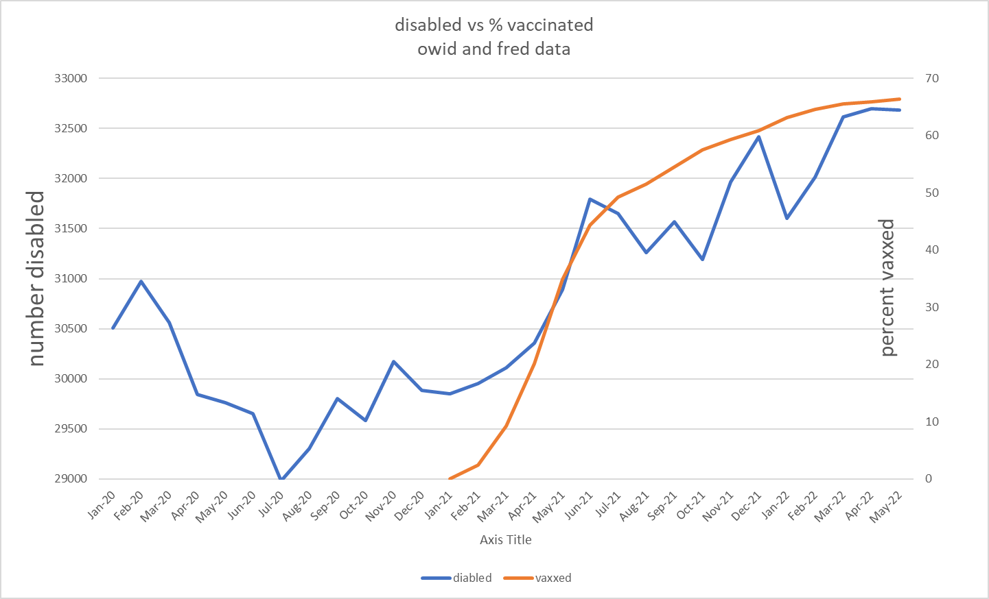
we can zoom in and really see the issue. data used is fred and owid. obviously, there is some chart crime here with the scaling, but the overall relationship is remarkable. this is basically what ben plotted.
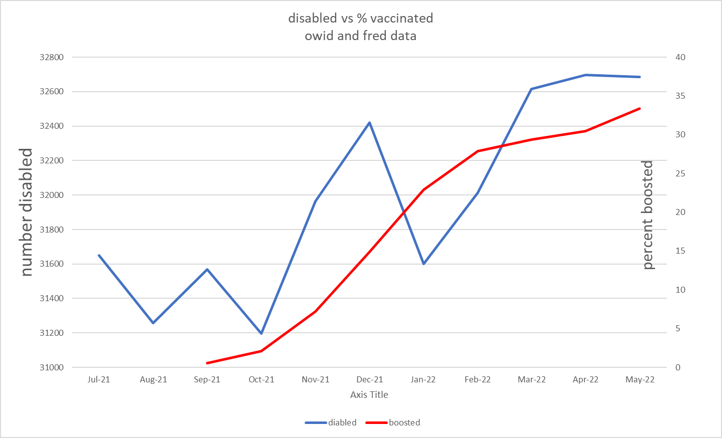
the second sharp upleg in october also interested me so i checked it against this:
it’s easy to take up trending series and lay their scales so they look correlated. the real test is bi-directionality. and this looks to be most damning of all. i took % vaxxed each month and subtracted the prior month to get “% of population vaxxed in month.” this should give us a sense of the people at risk of vaccine complications at any given time. to this i added the same treatment to the booster series to get a total % of population getting a vaccine each month.
i then plotted this series against disability.
the vaccination series started to get steep in feb 21. disability got steep in april 21.
vaccination peaked in may. disability peaked in june.
vaccination started to rise again after august.
disability began to rise again after october.
then vaxx dropped off after jan 2022 and disability flattened out in mar 2022.
2 month lag, 1 month lag, 2 month lag, 2 month lag. 4 separate inflections all tracked in near identical and highly plausible timeframes for vaccine injury. we’re starting to get past “suggestive” here.
this zigs, zags, then zigs again, then zags again all as predicted if it were causal and all with the sort of lag you’d associate with reporting, 1-2 months. (all 2 mo save may-jun 21)
the disability series can be a little noisy month to month, but the big trends are all there.
based on what we know about side effects this looks to be an odds on hypothesis at this point. i can see no better fit to the data.
anyone seeing flaws here? what are we missing? is there another explanation?
“the vaccines just put 1.8 million americans into disability” is a big claim.
i want to stress, this is still a hypothesis and this is my first run through with this data so i want to let people chew on it and see what else emerges before making claims that are too strong.
but this is also REALLY provocative and unless i have really missed something, warrants research and explication, not censorship.
please spread the word and let’s get some eyes on this.


I have the Fred slide in my elephant deck. Clearly, great minds think alike. But your analysis was more more thorough than mine
Wow, I really appreciated that BA.4 BA.5 post earlier today, and now it is followed up with this.
Thank you very much!
Substack seems to be filled with folks and cats who almost singlehandedly provide more accurate, useful and interesting news than the whole msm.