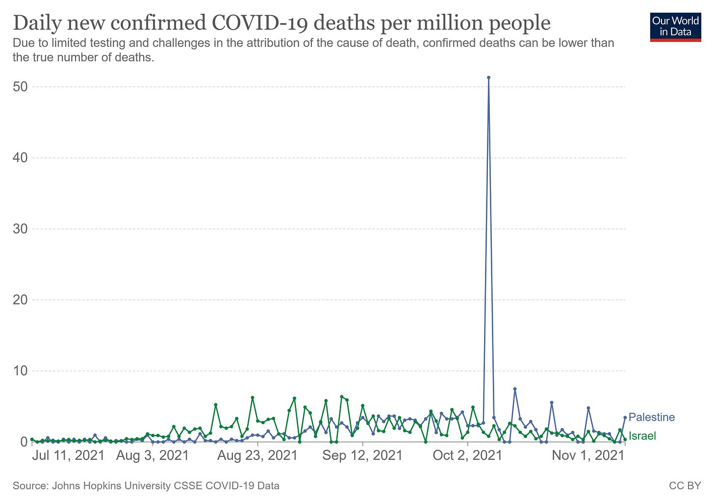
vaccines seem to be having no effect on covid death rates in israel when compared to low vaxx palestine
don't mistake seasonality for vaccine efficacy or lack thereof
seasonality signals in covid swamp everything else.
an alarming number of people keep making the same mistakes around this issue. at a certain point, especially among purported experts, this can only be willful.
they do it in the US with the northern and southern states.
the north is more vaccinated than the south. so, in the summer, when the south is in high covid season and the north in low, people claim “see, vaccines are working!”
then, as the seasonality flips and the south goes low while the north rises, the media stops covering it and the vaccine skeptics start saying “see, vaccines make it worse!”
but the reality is more complex and mistaking seasonality for VE is worthless. so is comparing, at any given time, death rates around the world and regressing them against vaccination etc. this disease is so seasonal that that issue dominates all others and you’ll find a lack of correlation in damn near anything unless you control for seasonal expression.
this is why it’s best to use controls that share seasonality. comparing romania to france is not meaningful at any given time.
but comparing israel to palestine is.
the two have moved in near perfect lockstep all along, they share a border and a climate zone, are quite ethnically/genetically similar, and they make a great comp for vaccines because israel vaxxed early and reached high rates and palestine vaxxed late and has only hit low numbers.
for some reason, palestine tends to lag israel by about 4 weeks on their seasonality. honestly, as this is day of report and not day of incidence data, i suspect it may have more to do with data collection lag than anything else but it’s possible there is some genuine offset somewhere. still, it’s pretty hard not to be struck by how similar they are.
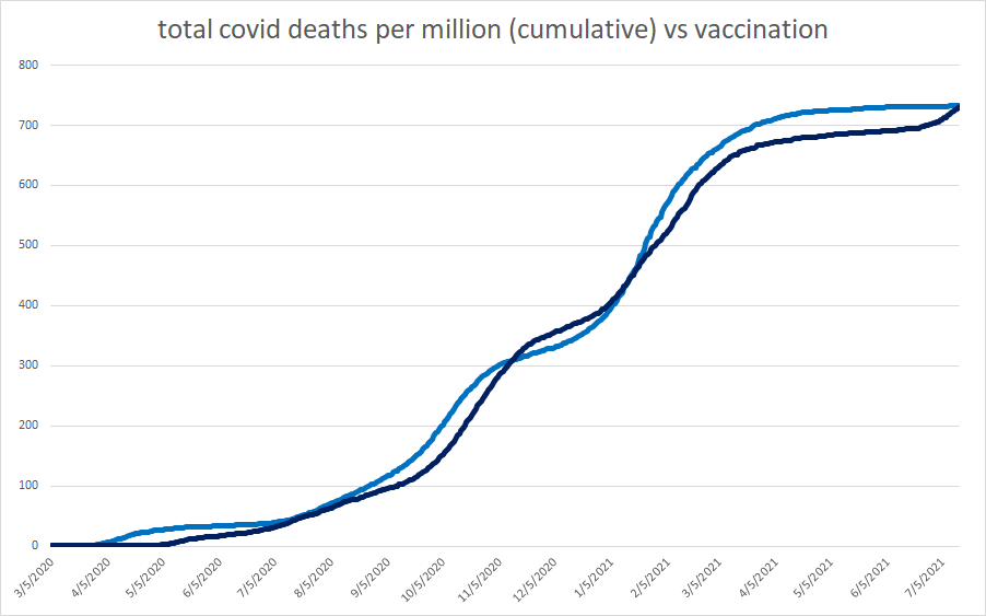
this is cumulative deaths per million with some key annotations.
israel began vaccinating in december 2020. they hit 60% on march 29 2021. on that date palestine still had zero vaccination.
the deaths in israel rapidly flattened. palestine kept rising. people called this a big victory for vaccines. but then a month later, palestine flattened too and that story fell apart. it was seasonal/reporting lag.
then, on aug 7th, israel surged again. palestine followed a few weeks later. they really have not looked different. 66% vaxx and 12% performed about the same in 2 countries that had been performing about the same all along.
note the sudden vertical jump in palestine. this was a one day data dump that took place on oct 6th. it is not a real epidemiological feature.
you can see that clearly here:
we have no idea what dates those deaths came from. for all we know, they were 2020.
this affects the shape of the curves materially. if we remove and normalize it, the curves look like this:
(i added vaccine rates as well, data from “our world in data”)
we can see quite a lot of we zoom in:
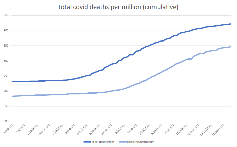
this graph starts at 7/1/21. israel was 64% vaxxed. palestine was a little shy of 10%.
israel rose from 731 to 922. gain of 191 total deaths per million.
palestine (absent data dump) rose from 683 to 847. gain of 164 deaths per million.
if every single death from that data dump was in this period (iffy claim, but a useful boundary condition and certainly possible), palestine rose from 683 to 895 a gain of 212.
so israel rises 191 to 922 total.
palestine rises 164-212 to 847-895 total.
so palestine, who started 7% lower on cumulative death, still wound up at a 3-8% lower cumulative number overall.
given the nature of data reporting, the reality is hard to guess with precision exactly where the number falls, but the idea that the performance is materially distinguishable from israel in any statistically significant fashion looks implausible.
10% vaxx performed pretty much just like 64% in two countries that had been performing similarly all along.
the best case is that an extra 5500 basis points of vaccination in a country that had higher deaths and thus more vulnerable culling to start and likely more pre-existing immunity from recovery stopped 10% of deaths. that implies about a 18% VE on deaths, and obviously, that’s an upper boundary.
the more likely case is that, within the limits of measurement here, nothing really changed and if it did, it was not material and almost certainly not stat sig.
you can see this clearly if i align the curves by seasonal signal/reporting lag.
without a legend, can you even tell the difference? (and note that one of those countries rose to 60% vaxxed in that period while the other was zero)
this is a well matched active and control group. you’d struggle to do better in an RCT.
and their performance post vaccination looks all but identical as well.
this seems to raise some real questions about “just what was the point of all this?
i would LOVE to comp all cause deaths figures, but they are not available for palestine.
but we CAN comp israel against itself and look at this fall’s seasonal spike with over 60% vaccinated vs last fall’s spike with none.
hard to see much difference there. this further bolsters the “so what was the point of all this?” issue.
i’d love to run this comp on other regional pairs/triads.
i’m looking for:
small countries that have only one seasonal zone that pair with other such countries. (US/canada, for example, is a lousy comp as seasonality and weather is too varied)
similar demographics
similar performance prior to vaccination as both evidence of good matching and to control for rates of previous exposure
similar reporting methodologies
significant variance in vaccination rates/uptake
anyone have some ideas on other places to look?
addendum:
one:
lots of people claiming that it’s the age difference in israel and palestine.
i don’t buy it. palestines avg age is low. it’s about 21. but so is israel’s. it’s about 30.
neither has a large elderly population.
but that’s all guesswork. the real question is this:
if age is such a factor, why didn’t it matter before? to the extent is was a factor, it must have been perfectly offset by some other issue (like better health care).
and if all these factors offset so perfectly and we got a pre vaxx simulacrum of outcomes and then vaccines worked, we’d see them bend the corves away from one another.
but this does not happen. it’s toally obvious when you stack them.
and totally obvious when you look at the curves for the recent period (from above)
two:
to people making suggestions on countries to compare: please read the criteria more carefully.
i need countries with good data and wide divergence in vaccine rates. the divergence in vaxx is critical or there is no variable to test. comparing 60% vs 54% tells us nothing.
thanks.


Interestingly, Gov. DeSantis was on the old Rush Limbaugh (Clay & Buck?) show today at 2:05PM EST and made the exact point that the virus has a seasonality to it, and accepted that Florida looks pretty awesome right now in part because of seasonality, and further predicted that the North will probably encounter difficult-to-explain times soon. His multi-prong approach that saw a bursting case rate over summer will pay dividends into the future as Florida's new long-term T-immunes enjoy robust immunity to new variants as the vaxxers everywhere else cause them to arise.
British Columbia, all cause mortality spiked 10-12% per month since the debut of the second dose at the and of May