did covid vaccines prevent covid deaths in the US?
a society scale assessment using the natural experiment of the 2020-21 covid season
there has been been a fair bit of discussion about covid vaccines (again) of late as many of the proponents of such products have been seeking to validate efficacy. but using counterfactual assumptions based on models is a deeply fraught and invalid process. mostly, one is just engaging in GIGO and “assumption farming” where those biases one plants into the models at inception may be later harvested and passed off as “results.”
but how could we assess this issue?
it occurred to be that something of a natural experiment along with something of a natural control group was available and that, while this is clearly not gold standard RCT level data it ought to be good enough to pick up a signal if the vaccines are anything like these massive efficacy levels of 85%+ that models have been presuming or the near total “death preventative” that folks like ashish jha have been claiming from their public health perches.
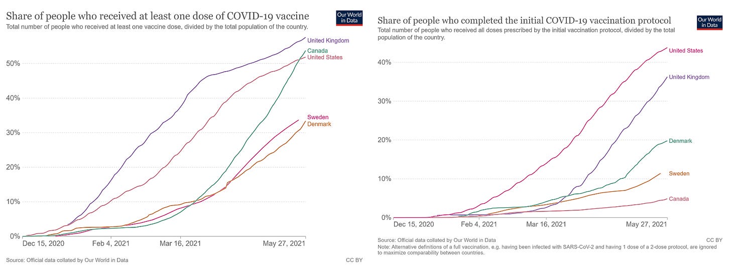
US vaccination began in mid december of 2020. by peak covid around mid jan, we’d seen 5% rates hit and by early march it was nearing 20% with at least one dose and 10% fully double dosed with 5% having been exceeded in early feb. this was highly focused on the oldest and most vulnerable among whom deaths would be most expected.
these vaxx trends came later in a number of comparable countries and basically missed the winter surge.
this sets up a basis for comparison between the US and itself and between the US and other countries.
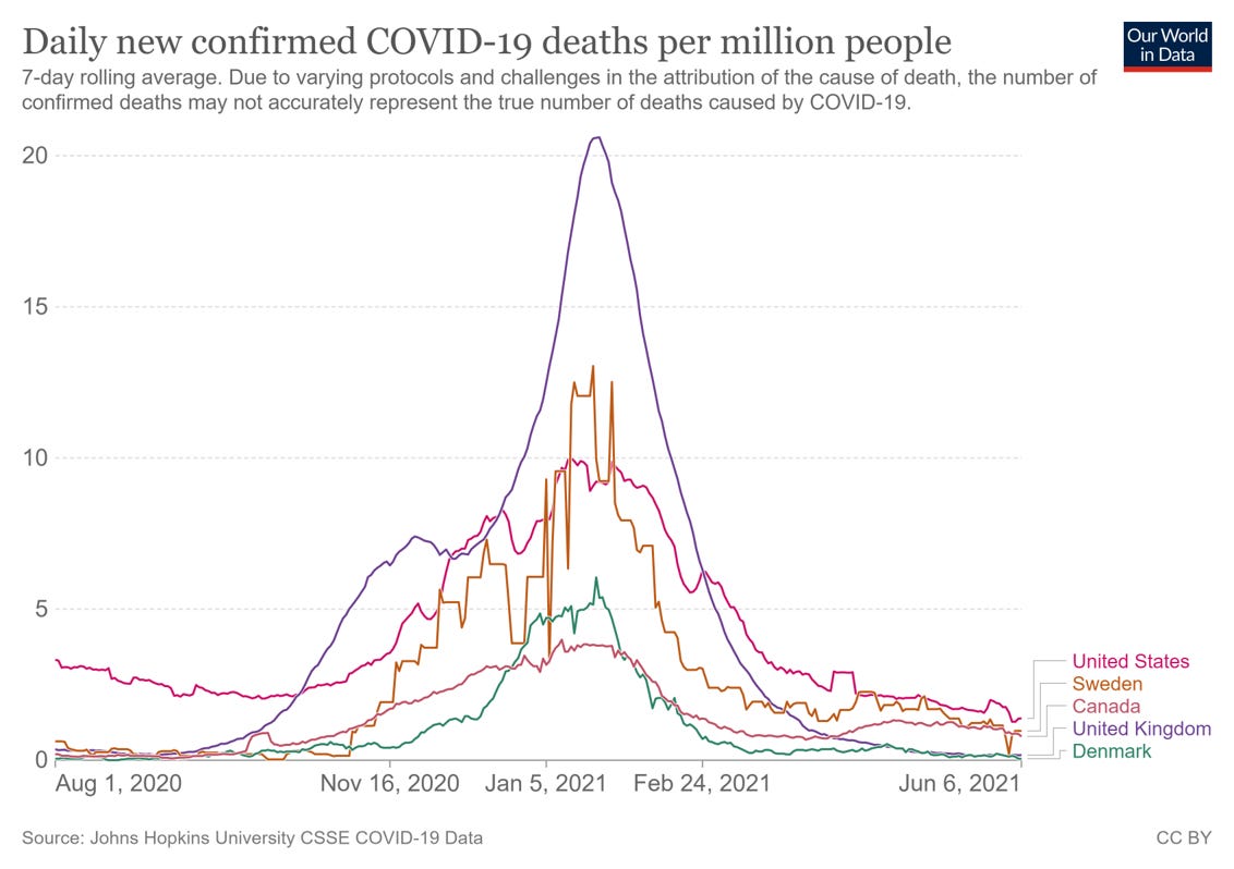
i selected 4, the UK, canada, sweden, and denmark because all seemed to have good reporting and all had strongly similar covid seasonality with single peak bell/gompertz shaped curves for deaths.
this is inherently a little arbitrary, but i chose them blind without first looking at data apart from basic alignment and vaxx variability and i’m doing this by hand, so there are some limits to capacity and as i will believe will become apparent, the result here looks quite provocative even in a small dataset.
all data above and in future graphs from OWID.
my basic premise is this:
the front side if the curve to viral peak had no vaccines. the curve down did and while their application was still somewhat low, they were highly focused in the highest risk populations. if their efficacy is anything like claimed even this number applied to the high death expectation cohorts should provide some sort of “curve bending” where deaths post peak look better than those before.
one can measure this as a ratio of deaths in the back half of the curve vs those in the front and then calculate a ratio of back as a % of front.
to the extent that the vaccine worked, you’d expect this to be negative.
to the extent that it did not, you’d expect symmetry or positivity.
in this way, each country serves as its own age/demographic/risk control. you’re comparing denmark to denmark etc.
a possible confound here is that we do not know the base shape of the curve and this is why i included 4 “controls” of other countries who vaxxed later and therefore likely had less or probably no effect on this surge each of whose b/f ratio we can also calculate as a comparator set.
i used the day of peak deaths for each country as a center (using 7 day MA to avoid data artifacts on reporting as much as possible) and then compared the 99 days on each side (plus peak) as the interval in which to compare volume under curve. as can be seen in the graph above, this captured the meat of key covid seasons from mid october to mid april.
this is not an ideal natural experiment (but then, they never are), but it seems good enough to at least give us some intuitions.
so let’s see what we get.
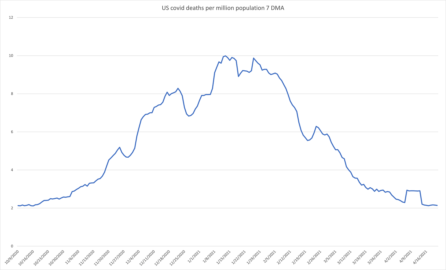
here’s US deaths. they peak jan 13th and have pretty good symmetry, perhaps a few artifacts but nothing too impactful.
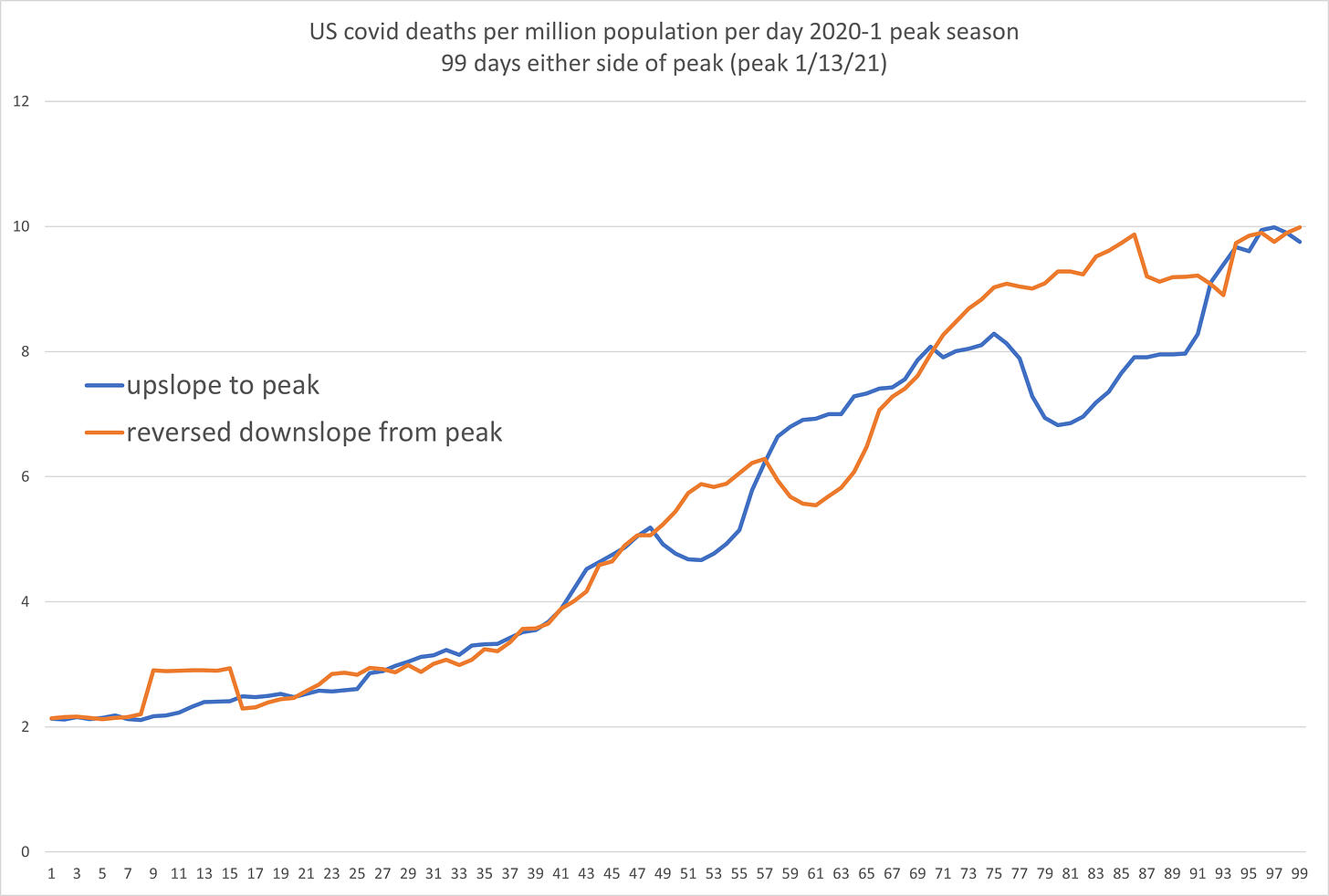
to get a sense of how the symmetry tracked, i cut the curve and flipped the back side so it can be seen overlaid to the front side. overall symmetry was pretty tight, especially in the left hand tail which, in many ways is the most important part because that’s comparing zero vaxx october to ~30% fully vaxxed april. if there were a big effect, you’d expect it to manifest there.
but such effect is conspicuously absent and symmetry is strong. the curves are not bending in any obvious way.
leaving out what looks like a data artifact in the back side series, the 45 days from 10/6/20 are basically indistinguishable from the 45 days ending 4/22/21 despite ~1/3 of the full US population and basically all the vulnerable being fully vaxxed in the second period.
to lay it out graphically, this is what we’re seeing and it is strongly counter to expectation of vaccines were highly effective at preventing death.
OK, so this provides some worrying initial intuitions but we are left with the problem of not knowing the basic shape of a curve without vaxx. perhaps these curves tend to be heavily back weighted and symmetry is actually a big win.
volume under curve is notoriously difficult to eyeball, so i calculated it using variance in cumulative deaths. overall, the back side of the curve was, peak to 99 days post 1.78% smaller than the 99 days pre-peak.
as can be seen, US compares extremely unfavorably to the other countries who vaxxed later.
i added tracking from the “second peak” of the US season as well (by aligning it with the median of the comparators) as it was nearly as high and aligned better with the seasonal peaks of the other countries and i wanted to be sure i was not inadvertently cherry-picking or injecting an inadvertent seasonal signal.
as can be seen US was a large outlier and not in a good way. other countries saw the back half of the curve drop 35-53% vs the front. (avg -41%, median -40%) while the US dropped only 1.78% from true peak or 18.48% from aligned peak.
that’s not even half the base drop of those who vaxxed much later.
this curve does, indeed, look bent, but appears to be bent in the wrong direction.
extrapolating from the average in peers, this would seem to imply that the US experienced a cumulative extra death count of 211/mm (early peak) or 133/mm (aligned peak) which amount so ~70k or 43k total deaths above peer expectation if the US curve had been shaped like the curves of the other 4.
this implies VE for deaths of -39% to -67%.
that is, to put it mildly, not good and makes US response appear singularly ill advised among this peer group.
does this mean the vaccines cause more covid deaths overall in the long run?
i’m not sure. you cannot really demonstrate that from this analysis though it’s certainly a claim consistent with the data.
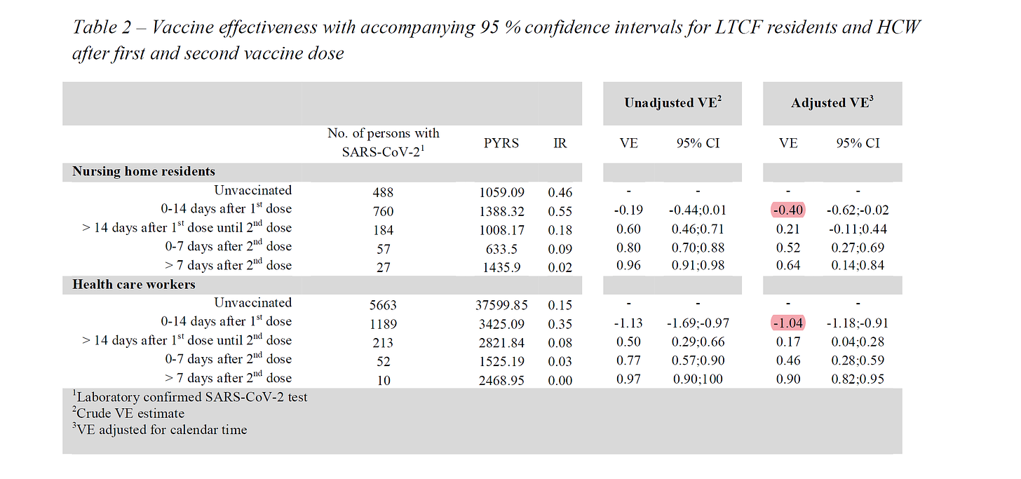
the stronger claim here would seem to be that dosing people with covid vaxx during covid outbreak was always ill advised. reams of standing pandemic guidelines explicitly warn against vaccination programs during ongoing epidemic disease and there would appear to be a strong set of well established issues particular to many of the covid vaccines where the period after dosing has strong negative VE on cases in the 2 weeks after the first dose.
this has led to A LOT of really questionable assessment of overall vaccine efficacy that has essentially amounted to bayseian datacrime.
links to this study, several others, and general discussion HERE and HERE.
and this is certainly a plausible reason for the US curve to bend the wrong way as ~40% of the US population got it’s first dose during the back half interval.
this starts to make the “vaccines saved lives from covid deaths” argument look less and less plausible.
based on this, it looks like they are associated with considerably more covid death over the peak 2020-21 season.
(this also may be heavily mRNA jab biased as the UK has an early surge in dose one, but was using a lot of AZ then (which is adenovirus based) and does not seem to see this effect as US did.
i suppose one could try to argue that this was “one time” and that it then got better, but given the rapidity of vaccine fade, the tendency of the vaxxed to get far more covid cases than the unvaxxed, and the data from isreal showing booster association with more and not fewer covid deaths (HERE, and HERE) this starts to look like a seriously uphill fight for the pro-covid vaxx contingent.
even leaving aside the all cause mortality issues that have been so widely raised, this looks like real cause for worry and as though, at the very least, ongoing ideas about “get your jab for holiday travel” look badly misguided.
this data seems to stand in stark opposition to such guidance and would appear to caution strongly against it and the data canary of the 70+ age cohort in NY who is nearly 100% vaxxed is tracking up about 50% from same date year ago on hospitalization which is further cause for concern on antigenic fixation etc.
i remain astonished that this set of drugs are being assessed in such incomplete and slipshod fashion and that the US health agencies are pushing them on such a paucity of clinical data and in opposition to such strong societal signals. i’m not sure there is any real precedent for it in human history.
so, OK, this is a new set of ideas and methodology to look at this. it seems (to me) to have some provocative and compelling implications and fit neatly with many other pieces of the mosaic.
have it it. what did i miss or mistake? where can this be extended or tightened?






Better question: where is the evidence from spring 2020 that a vaccine was needed?
It’s been too long to remain astonished. Hell is empty, the demons are all here.