if covid vaccines stop covid deaths, then why do they keep bending curves the wrong way?
another look at the US data
it seems like you cannot swing a sack of desperate epidemiologists around your head these days without hitting another “model” claiming that “vaccines saved upmteen squinjillion lives” but i fear these these weapons of mass deception are just overwrought GIGO engines that run on bad assumption, bad data, and worse study design/definitional hijinks.
but there is a simple truth test to these matters: if these vaccines were anything like as efficacious as claimed, dosing them into 70%+ of populations (and 90-95% of high risk of death populations) then they would be bending the covid curves like neutrons stars bend spacetime.
the effects would not be subtle.
they would rise to “air horn in the vatican” levels of obviousness and unmistakability.
yet we see no such signals.
and this casts serious doubt on efficacy claims.
the data to do the really rigorous work is being withheld from us and so, like astronomers unable to see celestial bodies, we must infer or refute their existence by watching how things curve as they travel through space and time.
but try as we might to find it, planet “vaccines stop covid deaths” does not seem to exist.
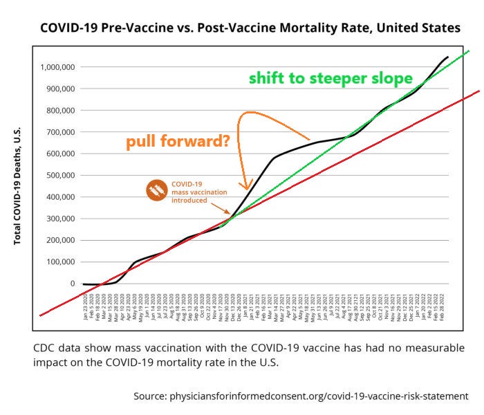
physicians for informed consent recently published this chart to which i have added some colored lines. (i’m not sure why they called it “mortality rate” as it’s just depicting “mortality” but this does not affect the analysis.)
covid deaths had been tracking at a quite linear trajectory. then, right around the commencement of mass vaccination in the US, they accelerated (despite a less deadly variant, more acquired resistance in the population, and the prior cull of high risk groups.)
the curve bent the wrong way.
the red line shows what a continuation at prior rate would have looked like.
the green line shows the durable shift to a new, steeper slope. (more deaths per day)
this is an unexpected and (obviously) unwanted result.
of further concern is the excursion above this slope immediately following vaccines going into broad use where deaths picked up dramatically and then subsided to a lesser rate than even the red line before then resuming their inexorable climb at the new higher rate in the fall of 2021.
note that this precedes the arrival of omicron in the US. omi hit in q1 2022. (this looks associated with yet another upward inflection in the slope of deaths despite omicron being the mildest variant yet and even greater rates of acquired resistance and vulnerable cohort depletion)
the “pull forward” marked in orange is of particular worry as it makes it look like the jabs were causing accelerated deaths and burned rapidly through a group then saw fatality subside as the group was depleted. this finds worrying alignment with the well established issue of 14-21 days of serious immune suppression post jab.
we were seeing clear evidence of this all the way back in march of 2021. (excerpt from prior PIECE)
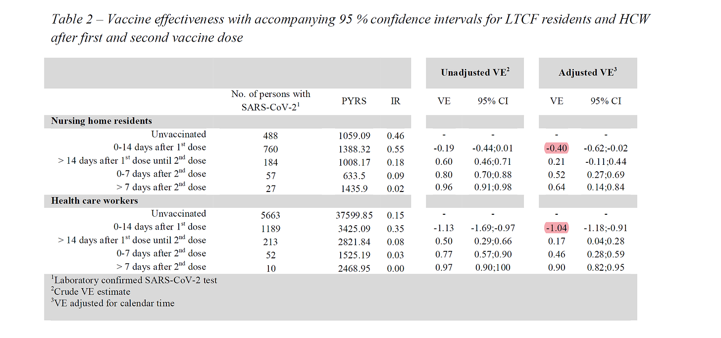
in this STUDY the danes found dramatic increases in infection rates post vaccination. “adjusted VE” is the risk adjusted vaccine efficacy. it was -40% for nursing home residents and -104% for health care workers in those homes. it more than doubled their risk. (it’s to be expected that the younger, healthier HCW’s would see more drop vs the NH residents in the event of immuno-suppression as they had more effective immune systems to suppress. we see the same reflected in peak VE of 90% for HCW vs 64% in residents)
note that this is all in the 14 days post dose 1. VE ramped up over time, but those first two weeks were a serious risk accelerant. 40-100% rise in risk is no joke.
and this study does not stand alone. it was, in fact, validated in pfizer’s own data as laid out here by dr clare craig, a UK pathologist whose work i have followed, in her BMJ piece.
“As well as the papers cited by the authors, other studies have shown a similar effect. A Danish study showed a 40% increase in infections in the first two weeks after Pfizer-BioNTech vaccination, despite not vaccinating in homes with recent outbreaks.[1] Indeed, the original Pfizer trial demonstrated a statistically significant 40% increase in ‘suspected COVID’, with 409 cases in the vaccination arm in the first week of the trial, compared with 287 in the placebo arm.[2] Other publications have omitted mention of the period immediately after vaccination.[3] [4] There is substantial anecdotal evidence of people who had tested negative prior to vaccination, becoming infected shortly afterwards, invariably attributed to exposure just before vaccination.[5] Others have raised concerns about this.[6]”
note that much (and possibly all) of the apparent later VE may be the result of the early negative VE. you can see how that works below.
and in practice HERE.
this data from the US finds consonance with another attempt i made to assess curve bend HERE where i took advantage of the natural experiment of the US rolling out vaccines in the middle of the covid peak season in 2020-1.
there as well, even when given every benefit of the doubt, we can see that the US curve bent the wrong way. other countries with similar seasonal expression saw the back half (post peak) of their deaths curve show ~40% fewer deaths. (avg -41%, median -40%) while the US was near symmetrical dropping less than 2% (or 18% if we align peaks to be sure we are not cherry picking)
extrapolating from the average in peers, this would seem to imply that the US experienced a cumulative extra death count of 211/mm (early peak) or 133/mm (aligned peak) which amounts to ~70k or 43k total deaths above peer expectation if the US curve had been shaped like the curves of the other 4.
this implies VE for deaths of -39% to -67%.
going back to the simple linear analysis above, had covid deaths stayed on the red line of pre-vaccine trajectory instead of accelerating to a higher one, we’d have ~300,000 fewer deaths today. in general, you’d expect that curve to attenuate rather than stay linear and so this number could well be higher if we plot more plausible epi.
it’s always a bit difficult to make a claim like this in the presence of such bad data, definition, and without a clear control group, but i think we can at least make strong claims about “having vaccinated during a surge pulling forward deaths” as there we do have strong, a priori reason to suspect this from RCTs, something of a control, and the effect is so well aligned and obvious.
would covid deaths have accelerated anyway? maybe. you cannot rule out contagion of new variants swamping their lower virulence as deaths = cases X case fatality rate. (though whether the vaccines have accelerated the case counts by making the vaxxed more susceptible to contracting and spreading covid is an open and interesting question and i the vast preponderance of the data implies that they do)
but we can seek to gain some intuition on this from one of the great natural experiments in covid: isreal and palestine.
they basically share a territory. the climate is the same, the gene pool is similar. the palestinians are younger, but the israelis have better healthcare and whatever the divergences were, they appeared to offset near perfectly until the end of 2021 as cumulative deaths per capita moved in a remarkable tight lockstep despite israel having more than twice the vaxxed rate and 12X the booster rate.
i’ve looked at this BEFORE.
but look what’s happening now.
covid deaths ended in low vaxx palestine in 2022 yet continue in isreal. this is NOT what one would hope to see. again, the curves bend away from one another in the “wrong” direction.
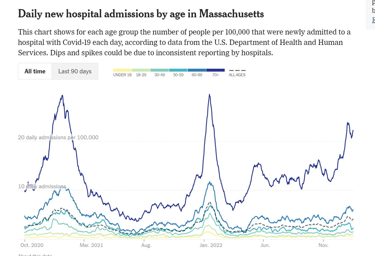
we have also seen hospitalization rates in the US improve least (or even accelerate) among the most vaxxed.
if this is vaccines working, i wonder, what would it take to describe them as failing?
there is just so much pattern here. it makes me suspect that the positive VE data from CDC and ONS is just GIGO.
if VE were anything like 50-90%, we’d be seeing massive curve bends that are simply nowhere in evidence.
playing games with extrapolated population counts or using some bayesian rigged study to establish VE then back into “lives saved” figure is just assumption. there is simply no way than an object as massive as all this vaccine efficacy could be traveling through our solar system and not be manifesting unmistakable effects on epi curves.
the failure to do so does however lead to some promising fields for further celestial inquiry.
more to come.


People who believe in climate models are even more dense than those who believe covid models. Its the same secular cult. PS Minor misspelling in that diagram.
I, a pissed off medical student, wrote about this a couple weeks ago in much less technical terms.
https://open.substack.com/pub/pemdasvulgaris/p/did-the-covid-vax-save-millions-of?r=204qj8&utm_medium=ios&utm_campaign=post
The main argument for vaccine efficacy historically was “there once was a horrible disease and now there’s not”. This assumption lead to the grandfathering of the COVID vax into the group of historical successes without any reflection on the reality of COVID trajectory. And obviously it’s even worse in counties like Australia and New Zealand with almost all mortality coming after the mass vax campaigns.
The predominant narrative at my medical school is vaccines = good so this vaccine = good and more doses of this vaccine = more good. That’s what 60k/year will get ya