i got some questions based on a comment in the progress is environmentalism piece from monday about cold killing far more people than heat.
fortuitously, there was just a wonderful piece of chart crime on this that i would like to both show the debunking of and use to demonstrate the data and relative magnitudes.
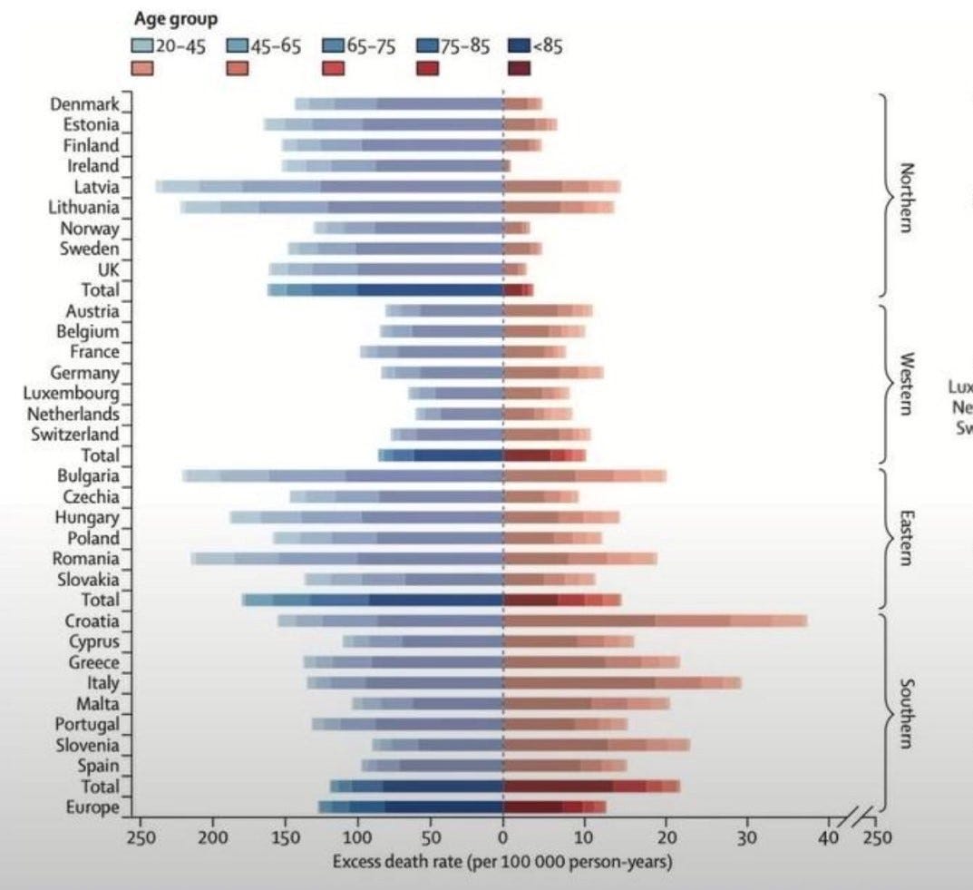
here’s the chartcrime as published in the alleged medical journal “the lancet” who has gone to such great lengths of late to beclown and besmirch its once august reputation. (LINK)
blue are deaths from cold, red deaths from heat.
can you spot the graphical felony?
look closely at the scaling. see how different the gradations are? it’s very nearly a full order of magnitude (10X) difference in scale.
this makes it look as if deaths from heat are somewhere close to deaths from cold or even exceed them in some places in the EU. but this is nothing like so.
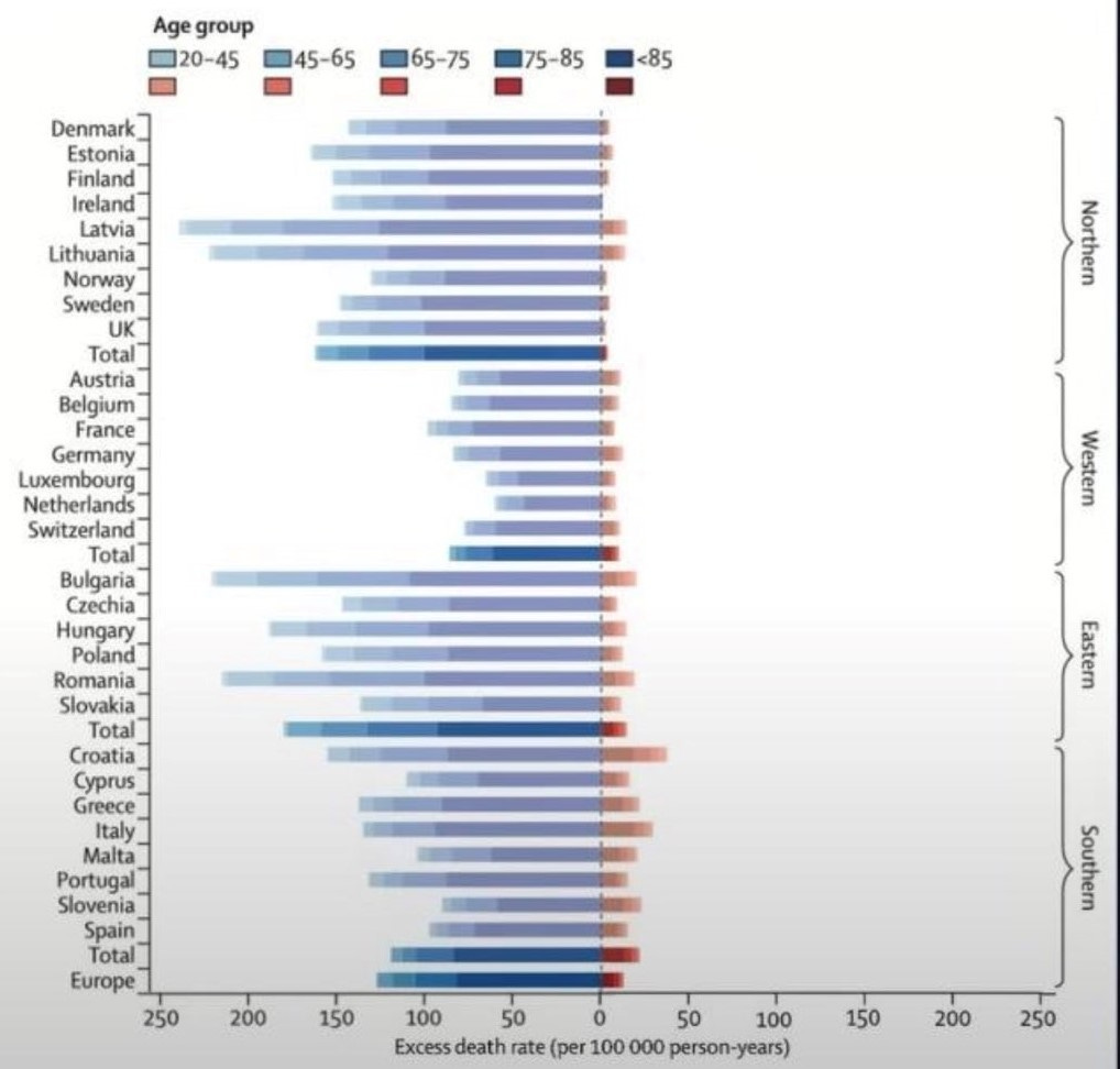
fortunately, the chart police rode in in the form of always poignant bjorn lomborg who generated a new graphic using even scaling.
quite a bit different, no?
heat is a rounding error in “climate deaths” in europe.
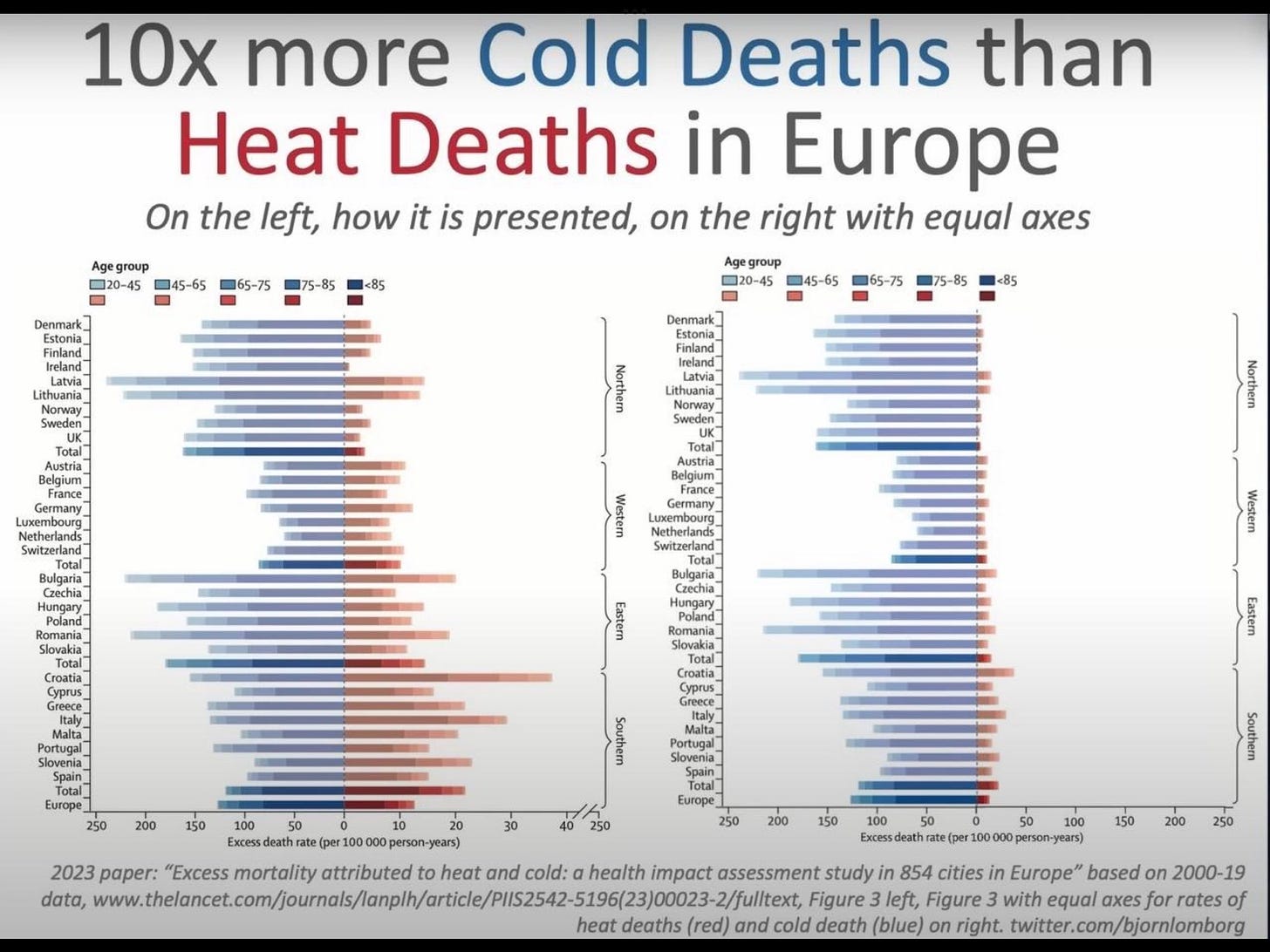
here’s the comparison in one graphic to make this easy to see:
(thanks to onetime greenpeace founder partick moore who produced this.)
so, as ever do be careful out there and cautious with what you think you see.
if a picture is worth 1000 words, imagine how many lies it can tell…


That is not an accident. An intern with fat fingers didn’t pick the wrong scale.
You are the carbon they want to reduce.
The absolute worst part is that they "cut" the scale on the right and then put the final graduation mark as 250, the same as on the left. This is nothing less than deception and trickery. The obvious and only reason one might do such a thing is to fool you into thinking the scales are the same when they are not even close. Shame on the authors and the Lancet.