
another look at UK all cause mortality by vaxx status
using the ASMR data to look at the full vaccine experience
cliff notes:
using just ONS ASMR per person-year data from their own calculations, we can still show that vaccination is associated with alarmingly higher all cause death rates by may 2022
this becomes more pronounced when we add in the 21 day post jab period excluded from most analyses as that period shows greatly elevated risk of death vs both unvaxxed and that same vaxxed cohort at 21 days+
the signals in young men are especially elevated and worrying. this may bear on the “died suddenly” athlete issue.
once arranged in a proper bayesian stack (even giving vaxx efficacy the large benefits of not including the 21 day risk windows or the drop outs who have such bad reactions to a dose that they do not progress on to the next one) it becomes obvious that the vaxxes are associated with much higher all cause deaths rates and a simple attempt to incorporate the risk windows makes it far worse.
these results align pretty well with my prior cut at assessing this issue and when fully loaded likely indicate that my first analysis was more likely to have understated risk (by using too high a vaxx rate) than overstating it.
analysis:
the history of covid vaccine studies and health agency communication is littered with what look to be numerous layers of deliberate manipulation and misrepresentation, some willful, some simply the result of ill informed trust in agencies and companies.
working through this data to attempt to remove or sidestep these injected biases has been bit of a drudge as the agencies holding the data have refused to release the raw records and have presented their analyses in such a manner as to bake in bad assumption and worse bayesian practice, especially when it comes to properly ascribing risk and outcome.
all this analysis is therefore never going to rise to full RCT standards, but we do the best we can with what we have and the fact remains: it’s easy to do a great deal better than the agencies themselves are doing by just trying to be a bit honest.
it is a follow up to this PIECE from monday.
the following analysis uses data from (and only from) table 5 in the ONS data spreadsheet found HERE that is based in the ONS’s own calculations for age standardized mortality rate per 100k person years.
as will be readily apparent, once you look at it properly it does not support that narrative that vaccines prevent overall deaths in the vaccinated and, especially once we apply even rudimentary baysian discipline upon the data, refutes it quite soundly. and this is a true best case scenario granting every home field advantage to team jab.
let’s look:
i like to start simple and then layer on analysis, so:
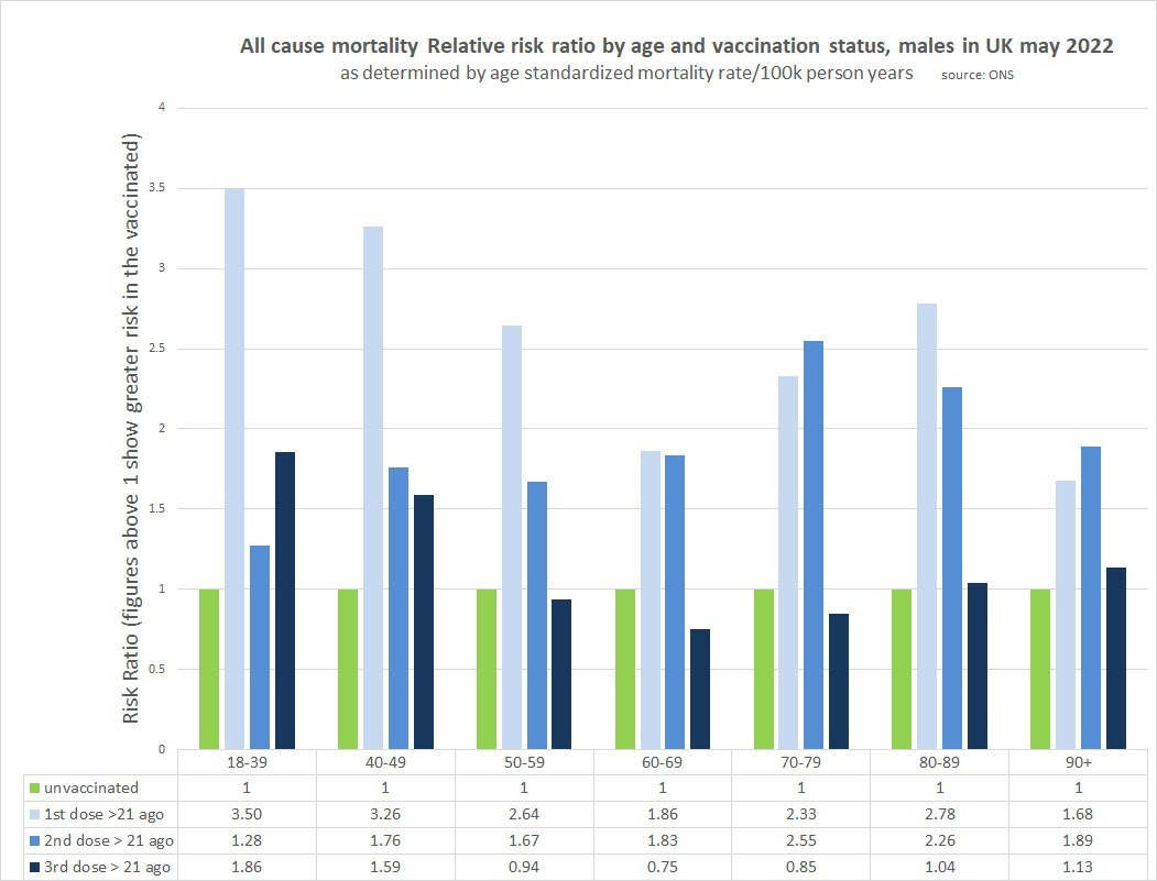
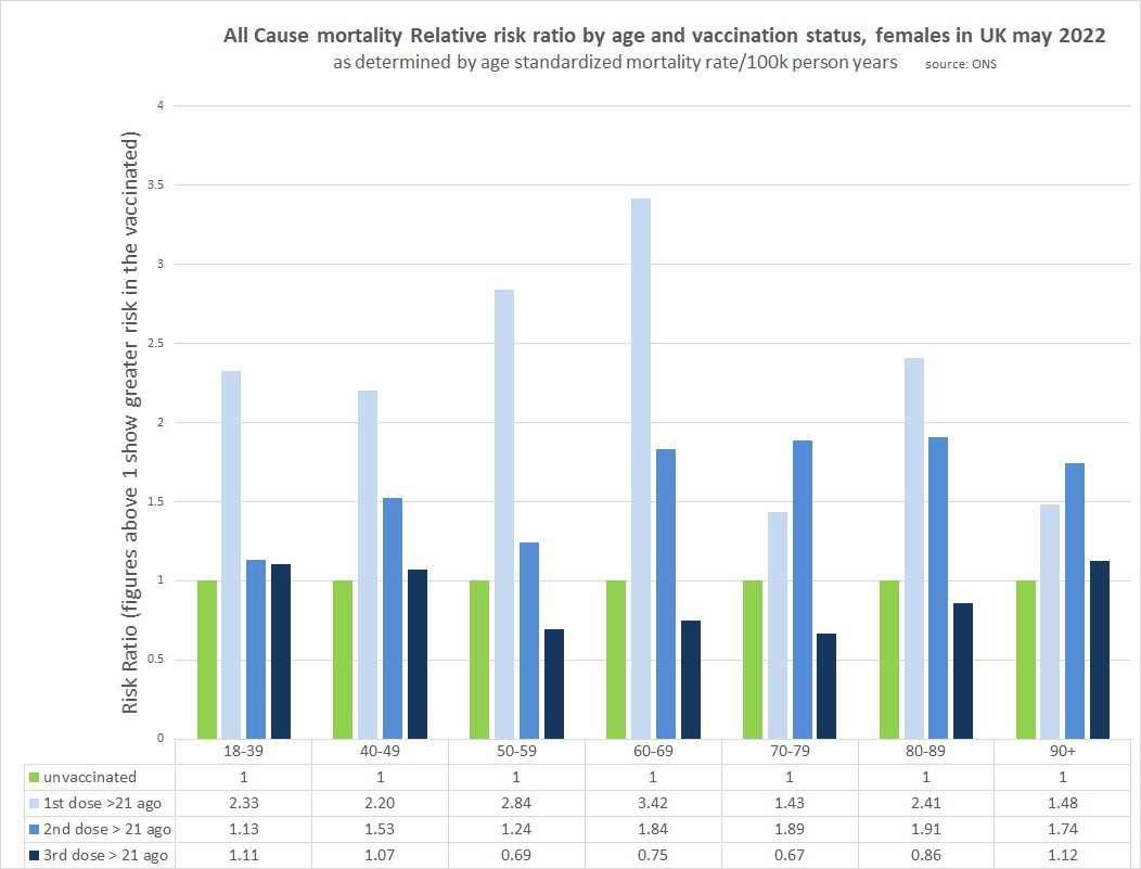
i took ONS age standardized mortality rate (ASMR) per 100k person years (a figure provided by them) and calculated some simple ratios sorted by age group and various forms of vaxx status. some of this data was non-calculable for the periods within 21 days of a dose because of an annoying convention ONS uses (<x for low numbers instead of an actual number) so i just plotted dose efficacy 21 days post each jab because it was complete and evaluable. (as you’ll see later, this would be considerably worse if we added in the 21 day “worry window” of elevated deaths post jab)
it is gender specific:
male:
female:
as can be readily seen, the case for vaxx efficacy is already looking pretty wobbly. dose one and dose two look pretty horrible and there is not a single instance of them being below 1 (vaccines associated with lower ASMR).
take particular note of the 18-39 male boosted RRR. 1.86. yowza. 1.59 for 40-9 as well. these subgroups are WAY out on the risk curve. this finds uneasy confluence with so many reports of athletes “suddenly dropping” and with studies that have shown that males seem to experience more heart damage from the jabs than females. i have no idea how to quantify the athlete trend and separate it from reporting bias, but those risk ratios are cause for alarm regardless and the odd lack of apparent interest of health agencies in this issue seems negligent.
but boosted +21 days does look better than unvaxxed in specific age bands, 50-79 males, 50-89 females.
so is this a group that ought to be getting boosters?
i don’t think so and the reason requires a quick diversion into how to calculate real risk per individual. foremost, we know one thing with 100% certainty:
those who are boosted for longer than 21 days were once boosted for fewer than 21 days.
this gets left out and this basic bayesian datacrime has been endemic to covid analysis and even the RCT’s used for initial approval. counting as vaxxed only those 14-21 days post vaxx and ignoring the high risk interval right afterwards or even attributing outcomes there to being unvaxxed (or double dosed in the case of boosters) is the literal equivalent of saying:
you’d be safer if you run to the other side of the busy highway but we’re going to call any hit by a car while trying “death for not crossing the highway.”
obviously, this is not a reasonable framing. you ALWAYS need to include the run to safety as part of the full equation. anything else is grossly dishonest and deliberately manipulative. this is not a mistake that companies like pfizer make. this is a choice. no one gets out of stats 101 without knowing this. (more HERE) (though to ONS’s credit, they are about the only agency to provide data on jab + 0-21 even if they do so in a difficult to integrate fashion)
so let’s start adding it back.
this data was not available in useful form for all age groups (same <x issue as above) and this issue is oddly confined to the <21 days post jab groups making many unevaluable, but i worked with what had useable numbers:
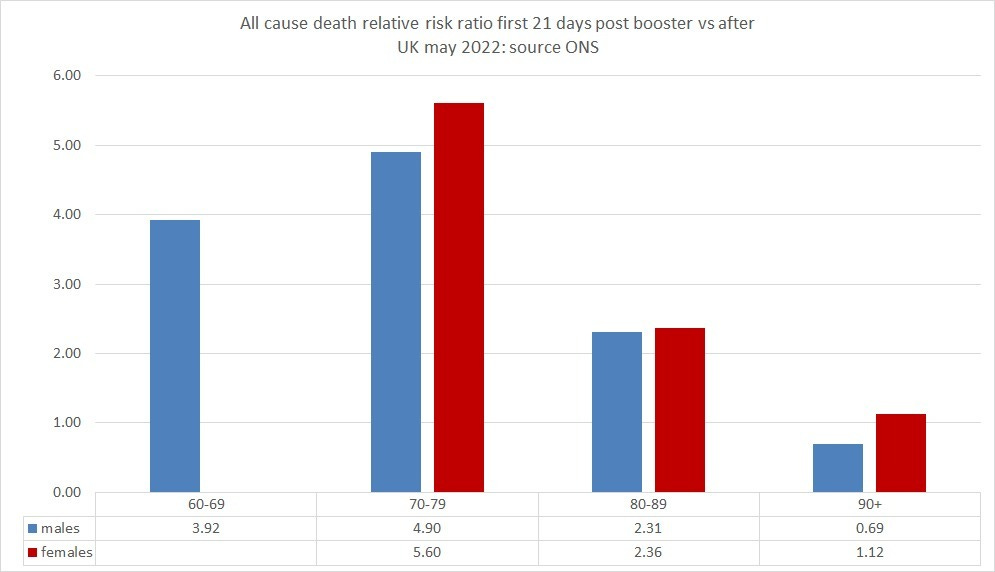
the 21 days post booster are obviously VERY high risk vs being unvaxxed for every group i could measure (except for some reason 90+ males.). i’m sure someone is going to try and the “you cannot compare those two groups” argument again despite it lacking any evidentiary foundation, so let’s head it off with data:
this is the ASMR risk ratio of the first 21 days post booster vs the risk for the same group from 21 days on. in nearly all cases, it’s even worse than vs unvaxxed. (also consistent with the unvaxxed being less, not more healthy as a base rate though it could also be a cull effect)
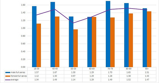
now we can start to stack this and account for the real all in risk of a booster vs that of having never started this series. i took a simple 6 month period of 182 days and then risk weighted the ASMR/100k person years by duration (21, 161) to get the actual rate of the whole course of treatment, both crossing the highway and getting to the other side. this is called “full boost” in this graph and is presented next to the base rate of >21 days for each gender for all age groups that had useable data.
as can be seen, the only “full boost” series showing any benefit is in females 80-89 and that’s not material at 0.99 RRR which is well within the error bars of “no effect”.
having to run the 21 day gauntlet post jab eliminates all benefit of reaching the other side and then some.
perhaps this is why so many trials and government reports have “conveniently” ignored this interval and only considered “fully vaxxed” as dose +14-21.
also keep in mind this data is also already experiencing an advantage from the extremely high risk ratios of “2 dosed” having culled cohorts relative to unvaxxed before they even arrive at jab 3 and from ignoring the fact that some had such bad reactions to jab 2 that they were not suited to going on and would forever remain in the high risk bucket and that there is no a priori way to know which group you will wind up in. ceteris paribus, this would be a large meaningful advantage and make later booster jab recipients trend healthier.
of course, this is still not a real lifecyle analysis because all people who get a third dose first went through being double dosed and as just mentioned, those rates are awful.
(and again, perhaps this is why so many abandoned it for “fully vaxxed” definitions in their analyses for efficacy)
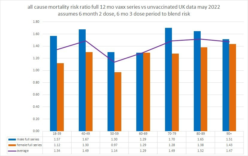
because the ONS data was not sufficient to include the 21 day risk windows for most age groups i simply left them out in this next aggregation. this will make vaccines look more beneficial than they are and further steel man the case but as is readily apparent, it does not matter in terms of where we land on overall risk ratios when we compare 12 months of unvaxxed to 6 months of 2 dose and 6 months 3. adding dose 1 would also make vaccines worse, but the overall person years are so low that i did not bother as the goal here is just to get a sound directional sense and some basic magnitude.
i chose to do this with current rather than trailing data to avoid intermingling past variants where vaccines may have worked better and thus providing a misleading slant to the data on current efficacy (another aggregation tactic many have used).
it’s also worth noting that this data is from may 2022 and further leaky vaccine variant escape may have occurred.
even with all this advantaging of vaccines, it looks like this and is obviously not favorable to the idea that vaccines are helping reduce all cause mortality.
there is also a pronounced “anti-male” bias in the jabs. women seem to fare better and as as good or mostly better in every age class.
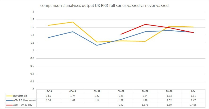
so, how did this look compared to the prior analysis? pretty close and to the extent that i was able to add in the 21 day “worry window” post booster this new take actually starts to look worse than my raw data analysis.
the fact that we are arriving at a fairly similar conclusions based on two different approaches (one now using only the ONS dataset from one tab of one sheet to sidestep data mismatch claims) and that there is reason to suspect a full instantiation of a 12 month lifecycle would make them closer still starts to add some credence to both methods and some confidence to the claims. if anything, i suspect the raw data analysis was a bit optimistic due to having chosen vaccine rates 7-11 months post the analysis period.
again, i wish i had better news to report, but the data is the data and we must follow where it leads.
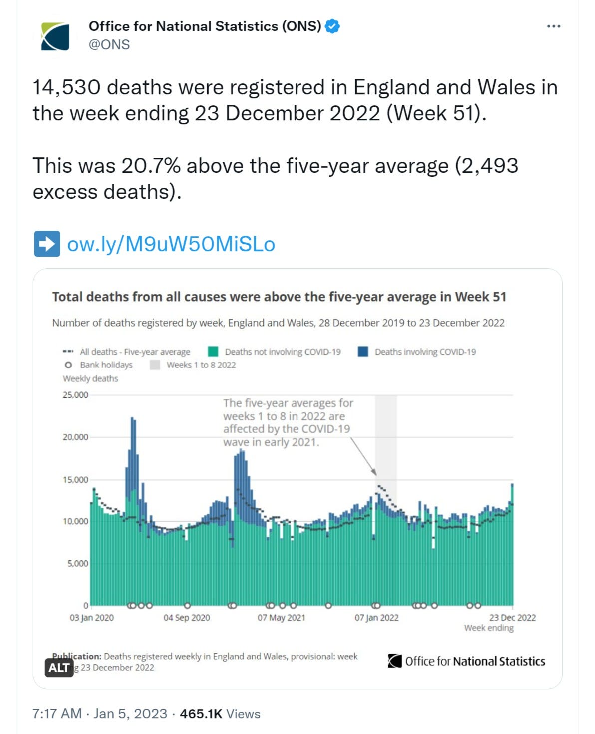
the currently elevated rates of all cause mortality (ACM) in the UK are deeply counter to base case expectation.
after a pandemic like this that pulled deaths forward and given the huge drop in covid deaths we would expect ACM to be significantly below trend. but it’s not.
the case that it is the vaccinated driving the currently elevated death levels looks to be the one most supported by the data and people are noticing.
this is going to demand explanation, because this is BAD.
it would be far easier if we could get the full raw data to do end to end analyses of the full experience of those undertaking these drug regimens with all the various runs across roads and reaching of other sides that then seem to crumble out from under you as either vaccine fades, virus escapes evolutionarily and becomes advantaged, or the apparent efficacy generated by bayesian mischaracterization times out.
it would be wonderful if some of these state actors would get serious about providing serious looks at real, auditable, unadulterated data, (tall ask from the folks who pushed and mandated this, i know) but, until then, it’s gonna have to be doing the best we can with what we have here at:









i don’t think so and the reason requires a quick diversion into how to calculate real risk per individual. foremost, we know one thing with 100% certainty:
those who are boosted for longer than 21 days were once boosted for fewer than 21 days.
--------
This also leads to a fake 100% VE, because everybody who didn't get through the worry window is counted as unvaxxed. Therefore, only the people who DO get through the worry window are counted as vaxxed -- and there's your fake 100% VE.
I’m glad my parents (82,81 in better than average health for their age) stopped at 3 shots - “I’m no lab rat”