one of the possible issues in looking at past danish VE data was the dreaded and all too common simpson’s paradox where the summation of groups inverts the signal shown in each group because of the manner in which the groups are weighted.
one way around this in covid is to slice the data by age group so that you do not get big mismatches in age/vaxx rate/etc.
i found a new pool of danish data that does so. i have not been able to figure out how to get access to the raw data so i am taking them at their word and using their calculation outputs, the inputs to which are opaque to me. data HERE.
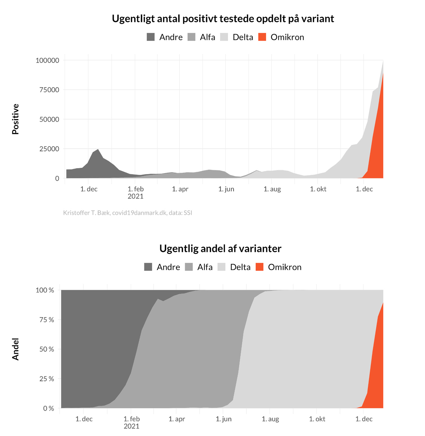
first we see that omi has really taken over and done so with great suddenness. it went from ~0 to 85-90% in 5 weeks. (all this data is frustratingly graphical and i cannot grab pure numbers)
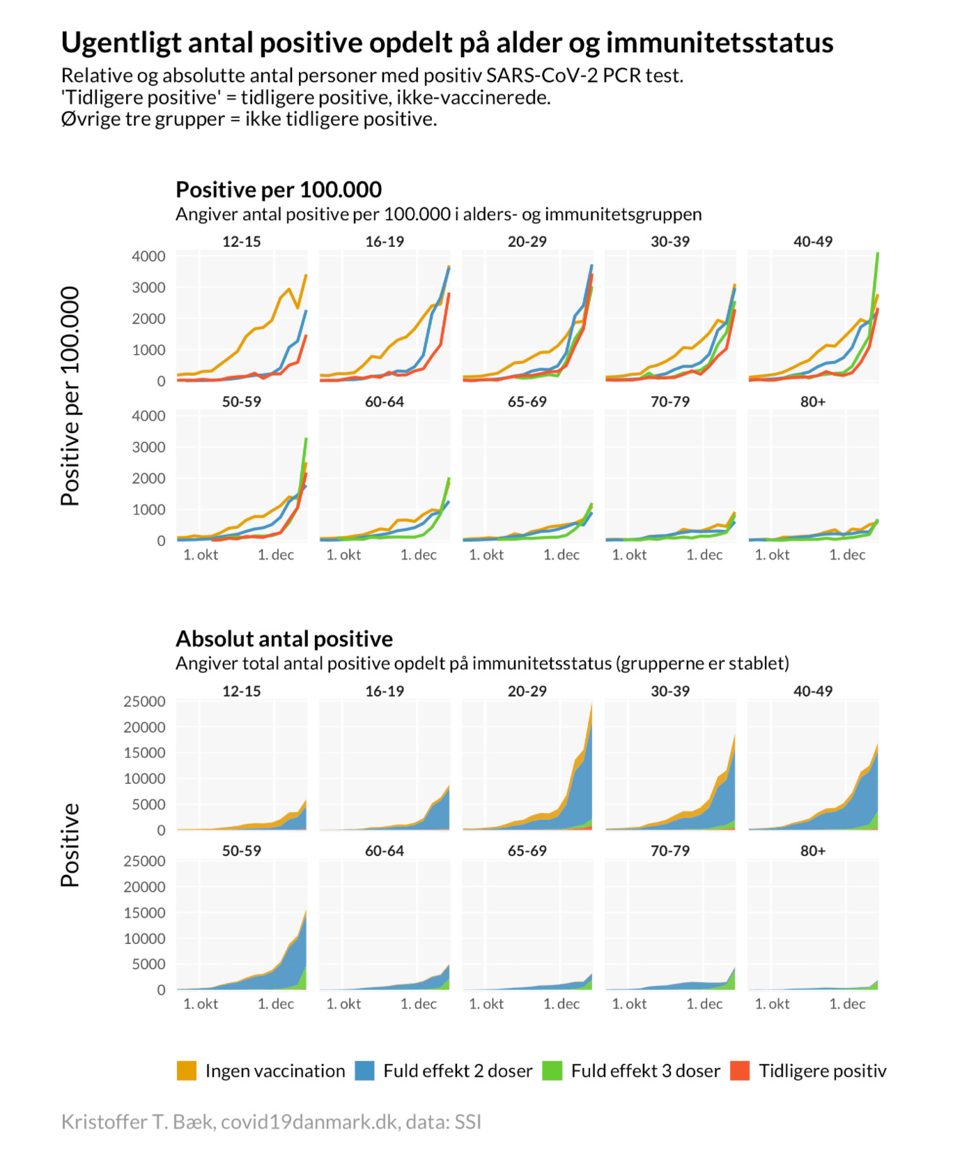
but we see something very interesting as this occurs. overall vaccine efficacy broken down by group inverts in pretty much every age group (apart from 12-15) and VE turns negative. the timing aligns with near perfection to the omi spread.
orange = unvaxxed
blue = fully vaxxed as 2nd dose + 2 weeks this is the same nasty salting game that has been played in so much of this data. the high risk period of immunosuppression and the high risk people who never progress to dose 2 are being excluded/lumped into unvaxxed detail on this issue HERE
green = boosted + 2 weeks, again, playing a blame shifting game. this makes boosters look more effective at the expense of “double vaxxed” this whole definitional practice is bayesian datacrime.
red = previously positive
this would seem to support the “omi as vaccine escape and likely OAS variant” hypothesis as we’re seeing in so many other places.
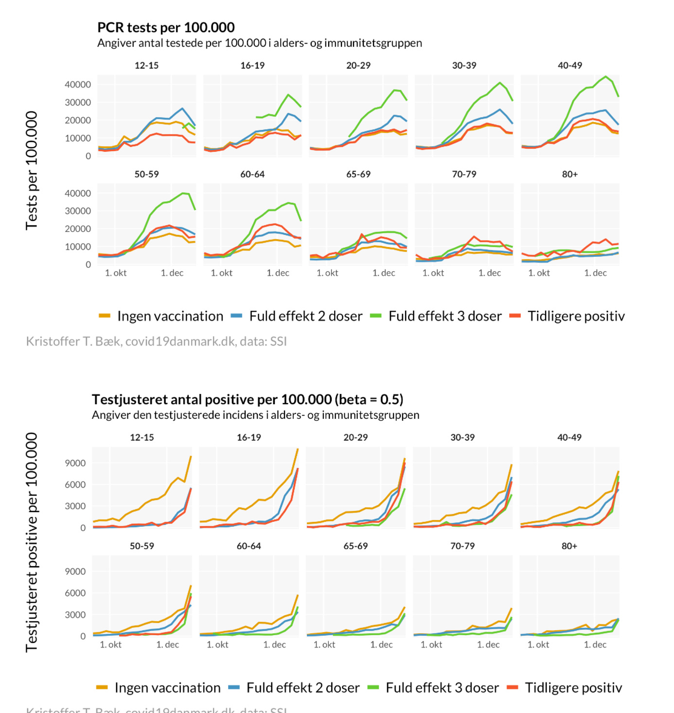
a possible confound here is testing rates. according to the same data, for some reason, the boosted are being tested at much higher rates. (i have no idea how this was calculated or from what data)
thus, when you adjust for testing rates, you change the signal. it now converges with vaxxed looking near identical to unvaxxed in key risk demographics from 40+.
but i am finding this data a little difficult to trust both because it bounces all over by age group and because booster and full vax invert and flip back seemingly at random cohort to cohort.
this smacks of data artifacts not epidemiological spread. it also carries another built in issue in that they applied a set of estimations (beta) onto this data to “adjust” for higher testing rates.
their assumption is as follows (using google translate)
this is, to put it bluntly, purely assumptive. we have no idea if this is true, no idea if 0.5 is the right number, and no way to validate it. this could easily be inverted where a population is seeing more tests because its high risk component is being tested over and over repeatedly and not from demographic expansion into the less risky.
this feels like a strong set of highly impactful assumption to bake into the data without first gathering sound factual basis. perhaps it’s correct. perhaps it’s very wrong. but as this adjustment is literally flipping the data’s relationship by vaxx status, it seems one ought to at least have some further validation before trusting it to give us the best answer.
i’m honestly just not sure what to make of it and would not want to base claims or decisions off of it just now.
effects on hospitalization are interesting, but tricky to interpret because of what is likely to be extreme cohort bias in a country with a vaxx rate this high. most who are unvaxxed are probably so due to medical reasons, not health and personal choice. this may provide a large confound and this is , obviously, nothing like an RCT. but we’re getting assumptive, so it’s hard to make strong claims.
a couple things pop here.
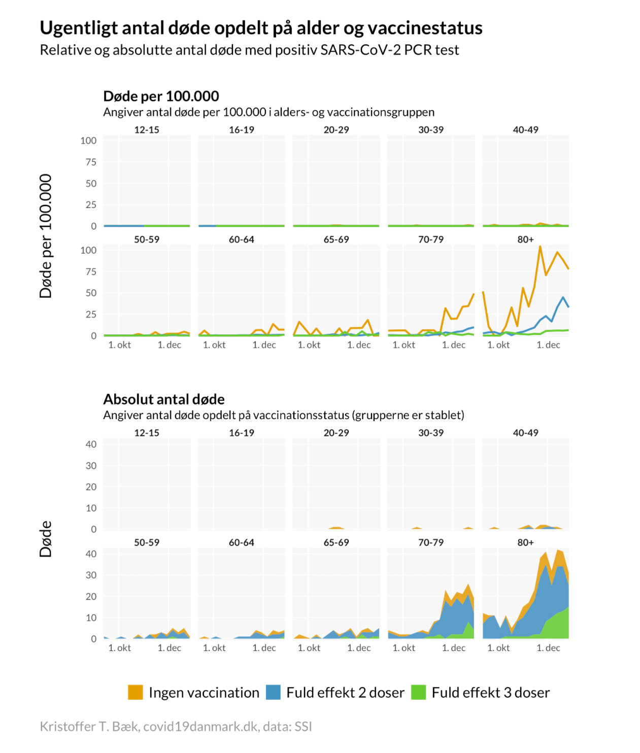
ignoring confounds, VE looks to be about 75% but drops as groups age
in 80+, it seems to be inverting for fully vaxxed (though they may be getting polluted by the booster driven immune suppression window lumping into “double vaxxed) keep in mind that the way that works is that because the 2 weeks of risk from getting boosted are not associated with “booster” it makes booster VE look much higher and suppresses VE in full vaxx.
overall raw risk rates are exceedingly low for anyone under 65. 100 per 100k = 0.1% and we have no idea how much of that is “hospitalized for” vs “hospitalized with trace detection.”
overall most hospital intake is among the variously vaccinated (as one would expect given rates)
deaths remain basically at zero for any below 65.


This data source would be even better if they divided the non-vaxxed into "Can't be vaccinated" and "Do not wish to be vaccinated". There is likely to be a significant cohort of people who are unable for medical reasons to take the vaccines, and at the same time are immuno-compromised. These people will die of covid at a higher rate than average, and increase the death rate in the "non-vaxxed categories".
This gets so tiring....all of these graphs and charts developed from worthless testing and assembled by biased people twisting facts for malevolent purposes. Everyone gets sucked into the lie and reports it as if they are truth to 1% accuracy. There is no truth when you start out with a lie.
Nobel Laureate, PCR Inventor Said Fauci Was a Liar, Abusing Test Data For An Agenda And Afraid To Debate – Round Table Report
https://roundtablereport.com/?p=6582